Why Prefer Sketch over Other Interface Design Tools?

After dominating the market of design tools for two decades, Adobe Photoshop’s supremacy has been challenged by Sketch, Figma, InVision Studio, and others. Photoshop users have been massively switching to Sketch. The heavyweights like Apple, Facebook, Google, PayPal, Soundcloud, and Stripe are using it. And yet, a lot of the designers favor Photoshop. Most UI/UX design jobs on Indeed suggest that Photoshop skills are required, and many clients of digital agencies still know more about PSDs and what to expect from Photoshop.
Taking advantage of several design tools for different purposes, we are not going to argue for which one is better. Instead, we’d like to cover the benefits which Sketch offers to businesses that wish to create a mobile or web application.
The Role of Interface Design Tools
It will be helpful to speak about the design tools in a context. The UI/UX design phase, which precedes the development of a product’s functional elements, starts with discovering the users and needs:
- What is the product’s purpose?
- Who are the end-users?
- What functionalities are necessary for meeting their needs?
- How will the product be used?
With this information, after an analysis of the market and any business or functionality-related limitations, the product design team can figure out the optimal product’s interfaces. Then, scenarios of the user-product interactions are created. The team must develop optimal paths for the user to browse the website or interact with the mobile app’s screens before they reach the goal. The ‘interaction design’ stage requires at least low-fidelity mockups for a ‘design wall’: the team must communicate and work through user experience ideas.

Paper and pencils can do at this stage, but best results are delivered when a clickable prototype, i.e. draft version of the product, is used. It may be quite rough, e.g., done in Balsamiq, although Alternative-spaces’ UI/UX designers utilize Sketch in interaction design as well. An interactive prototype helps identify the best options and flaws early on and measure the product’s efficiency. This should be done before proceeding with the more effort-consuming layout design, much less the visual design.
For the layout design of the web pages and app screens, a wireframe tool is a must. A web-based application with collaboration features would be the best. You’ll need to share the drafts with all parties, give and receive feedback, take notes, and see the changes in real time. The team must work out the main interface forms and requirements for the location, priority, form, and content of the product’s texts and graphical and functional elements. These must fit into the interaction design and meet the usability standards. But the wireframes should not be necessarily high-fidelity and beautiful – that’s the goal of the next step.
It’s the visual design phase where Photoshop, Sketch, or similar software interface design tools must come into play. They are essential for the creation of:
- the UI’s visual elements (style, color, fonts, graphic solutions, etc.) to align with the corporate identity;
- association icons and graphic symbols;
- the general design of the key pages/screens.
With the resulting designs, a high-fidelity interactive model is created. It must not only fully render the look-and-feel of the future website or mobile app, but also enable all involved to make a final investigation and test the product’s usability. If needed, the prototype is revised and tested again and again. Once approved, the final design is added to the project’s specification documentation, forwarded to developers for estimation, or delivered directly to the programmers in charge.
Thus, the choice of design tools is primarily determined by the actual project needs. Are you designing a website, mobile app, desktop app, or two at a time? Do you need it fast? Do you need to see all the details and complex interactions? Is interaction simulation required? Do you need to collaborate on the project?
If you’re only interested in creating digital art, Photoshop is the go-to tool. If it’s a digital product design, Sketch does it better. If speed matters, Sketch is the option. If you’re really into Apple, Sketch is the option. If the price matters – you’ve guessed it. Let’s look at the details though.
The Benefits of Sketch for Web and Mobile Design
Although Photoshop was primarily a photo-editing tool, its flexibility and richness of features have been empowering web designers, including Alternative-spaces’, for years. The clients are familiar with PSDs and request them to use for references, and front-end developers know well how to apply them. The designers can do quality editing and a lot of manipulations in Photoshop. Its color management is excellent as well.
But the ability to do more with Photoshop doesn’t necessarily mean that it’s perfect for product design and iteration. As UI design has been evolving, so have the requirements for interface design tools. Our customers want quality UI/UX design fast and at a reasonable cost. These are the reasons why we prefer Sketch. It’s a combination of all that’s good about Photoshop and Illustrator, and we appreciate its simplicity and speed.
I. Simplicity
Sketch feels like Apple created it. Designers use similar keyboard shortcuts as in Keynote and Pages, and it’s simple for developers to integrate with. Sketch generally feels like it was built for seamless work of both parties.
The application offers only the features that are essential for UI projects. It doesn’t have 3D tools, photo filters, and other irrelevant and distracting features. Thanks to its clean and simplistic interface, organizing documents and making revisions feel more comfortable, than, say, in Photoshop. Sketch documents are also smaller, quick to load up and work on, and not too heavy for a hard drive.
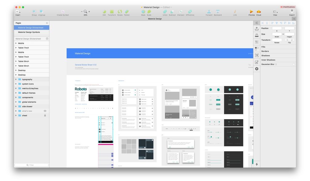
There are default libraries with Google Material Design and Apple iOS UI design templates. The recent integration of the official iOS 11 templates allows downloading the UI Library in one click and quickly adding toolbars, buttons, and other elements from the Insert menu. Moreover, Sketch will notify the designers of new resources or changes to the iOS UI frameworks so that they can review existing projects accordingly.
Sketch allows for simple creation of multiple artboards and offers 28 presets for most common screen sizes, which is really beneficial when getting the right dimensions for a responsive design. Mood boards are simple to create as well. All of the files can live in one document. A page drawer in the artboard sidebar allows for quick scrolling between files. The ability to switch between the site tree, the mood board, and mockups is particularly helpful on large projects.

Since all files can be accessed in a single document, it’s much easier to copy and paste objects and object styles, including color gradients and color fills, from all of the designer’s files.
Typographic elements are created quickly and can be applied in other documents. When the designer updates the font once, the style in the entire project will be updated automatically. Sketch’s native text rendering means that the text used in the design file will look exactly like in the browser. Generally, its rendering is close to the web (which can’t be said about Photoshop).
Sketch’s built-in layout grid allows for pinning a transparent layout guide and for changing the column and gutter sizes easily. Sketch is also pixel-aware. The created shapes come to the nearest pixel, eliminating the issues of blurry lines and images. With a marquee tool, one can open the info palette, draw the distance between two objects, and promptly check the results. Photoshop’s ruler seems cumbersome compared to this.
The shared styles in Sketch save the stylistic attributes of a layer and keep every layer connected to the style in case it changes. If the designer decides to change the style of a layer at any point, one click will instantly sync the style to every layer sharing it.
To compensate for its limited tools, Sketch has a lot of plugins, i.e. extensions that can be downloaded and installed within the program. They save time, solve problems, facilitate the designers’ creativity, and help save money after all. The plugins have everything covered.
For example, Sketch Mirror makes it possible to test the created designs easily on an actual smartphone and even to make tweaks while face-to-face with the customer. The Style Inventory plugin allows for creating an inventory of all the HEX codes of colors and swatches used on the page. It can be used on text styles too. The Day Player plugin enables designers to fill in the placeholders from different image services easily.
Using Craft, the designers can prototype within Sketch and sync the result to InVision. (It’s an interactive prototyping tool with collaboration features.) This helps simulate the versatility and use of the products on a desktop and mobile devices. This way, we review, test and share the created UI prototypes with the customers, developers, and other team members. Another instrument for interactive UIs, Principle, is used for demonstrating a product’s animations.
Converting designs into CSS is comfortable with Sketch because CSS styles for various elements can be copied accurately. Additionally, a group of objects can be converted into a symbol to be copied, repeated, and synced to all situations where changes are made to the object.
II. Speed
Sketch’s multiple artboards feature allows the designer to see the desktop, tablet, and mobile mockups in one view. This helps work on them simultaneously. When editing the symbols, colors, or text styles, the designer can be aware of the effect of the changes in all mockups.
A lot of the time and energy can be saved thanks to the Sketch features which help resize objects freely. Photoshop allows resizing groups and smart objects with only one ‘physical’ mechanic – stretching the contents together. Sketch allows making the contents of a group or symbol behave more ‘responsively’ by preserving margins or fixing dimensions in place. No more distorted layouts and messing around with the position and scale of individual layers.
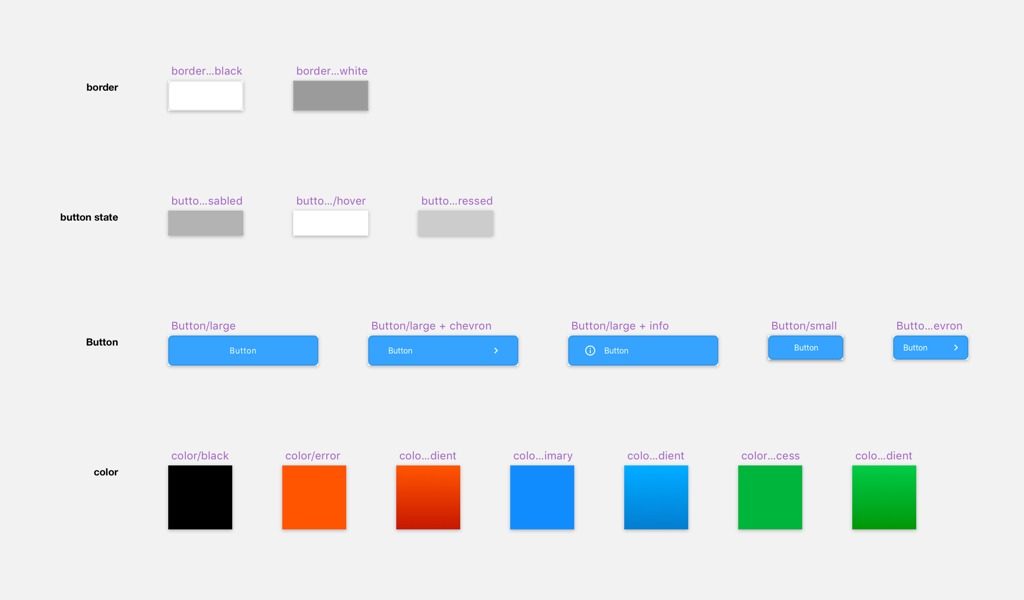
Sketch’s symbols make it easier to work with the size of the images, text, and colors at the same time. This saves a lot of work time. The symbols look similar to smart objects in Photoshop, enabling designers to use multiple instances of the same element that sync with a ‘master. ‘ However, sometimes they do need each of a symbol’s instances to have unique content. Sketch has a great solution. Every text layer, symbol, and image within a symbol is considered a variable that can be ‘overridden’ on the Inspector. The designer can create one button and use it as many times as they please while retaining control of the content for all individual instances.

Using the Paddy plugin, the designer can apply padding to either a shape layer or a symbol of a group. The ‘Background’ layer will automatically resize itself so that it surrounds all other layers within that group by a specified amount. All the properties are indicated in the layer’s name. This allows to see what spacing is applied to the layers and groups.
Other free and paid assets available on Sketchappresources.com help speed up the design and development work. For instance, Launchpad plugin exports responsive designs as production-ready HTML/CSS in seconds. Although the developers need to tweak the code output, the plugin still saves countless hours of work.
Drawbacks?
We don’t mean to say that Sketch is a cure-all. As a little fly in the ointment, we can mention some of the instrument’s cons as compared to the good old Photoshop:
- Sketch is only available on Macs.
- Sketch has only one level of zoom. (At the same time, it’s a better option when working with Retina displays.)
- Using multiple plugins takes a toll on RAM. However, multiple files open in Photoshop take up all of your RAM capacity too.
- A Sketch year license is relatively cheap ($99), but if the designers need to maximize their potential, they’ll start using multiple plugins, most of which require a monthly subscription.
Still, these can’t change the fact that the greater simplicity of Sketch speeds up the UI/UX design work, which translates to fewer billable hours for the customers.
Conclusion
For a long time, Photoshop has been a canonical tool for designers. It remains more feature-rich than Sketch and is still in demand. Loyalty and the learning curve problem play a role too: switching to Sketch or another software takes time and effort before the designer can become fully comfortable and creative with the new instrument.
However, we at Alternative-spaces are convinced that while the features that matter most are similar in Photoshop and Sketch, the latter helps create and refine interfaces more quickly and intuitively. The lightweight software combines the advantages of Photoshop and Illustrator. It’s simple to mock-up and easy to share with all parties. Finally, Sketch generally enables faster application as compared to Photoshop.
If you’re a designer, the Sketch vs. Photoshop or Sketch vs. Illustrator comparisons must have become irrelevant for you long ago. If you are a startup founder wishing to participate in product design, we recommend Sketch. Get a free trial, download some GUI templates, and install a few plugins to learn the basics. The ability to mockup and iterate more efficiently, work faster, and share the mockups with your team or clients will make a big difference.
Are you looking for quality product design and development done by professionals, fast and at a reasonable cost? Contact us and see what Alternative-spaces can do leveraging the advantages of Sketch!
Content created by our partner, Onix-systems.
 Home
Home