A Deep Dive into Booking Platform Design: Practical Tips and Tricks

In an ever-evolving travel industry, the harmony of user experience, efficiency, and innovation is paramount in capturing and maintaining the attention of modern-day travelers.
Navigating the intricacies of designing a travel booking app that keeps pace and sets new standards in this fiercely competitive market can be a challenge.
This article is your compass, offering valuable insights and expert tips on how to design a travel booking platform that stands out amidst the travel-tech landscape. Leveraging our firsthand experience, we’ll delve into the essential components, key design principles, and best practices that can elevate your travel booking platform to new heights.
Table of contents
- Design Matters: The Benefits of Custom Design in Travel Booking Platforms
- Tips and Tricks for Designing a Travel Booking Platform: Lessons from Industry Leaders
- Alternative Spaces’s Travel Booking Platform Design Expertise
- Summing Up
- FAQ
Design Matters: The Benefits of Custom Design in Travel Booking Platforms
Creating a custom travel booking platform design can make all the difference in the highly competitive realm of online travel booking. A custom design tailored to your specific target audience and business objectives can significantly impact user experience, engagement levels, and, ultimately, your bottom line.
In this section, we’ll delve into the compelling reasons highlighting the importance of crafting a custom travel booking website design.
Enhanced brand identity
Creating a custom design for a travel booking platform offers enhanced brand identity by providing a unique and tailored visual representation aligned with the brand’s values, message, and target audience. Moreover, a unique design aligns with brand values, resulting in a 23% increase in revenue.
A distinctive design helps reinforce the brand’s image, establish credibility, and differentiate the platform from competitors, ultimately contributing to a stronger and more memorable brand identity in the market.
Scalability and adaptability
Custom designs are flexible and can be adapted to accommodate changes, updates, and scaling as the platform grows. This adaptability ensures the platform remains efficient, relevant, and competitive in response to evolving industry trends, user demands, and technological advancements.
Optimized User Experience (UX)
Creating a custom design for a travel booking platform offers an optimized user experience by tailoring the interface and functionalities to meet users’ specific needs.
A custom design allows for intuitive navigation, faster load times, and a visually appealing layout, resulting in improved user satisfaction. Research by Forrester revealed that, on average, every dollar invested in UX brings 100 in return. This underscores the immense value of prioritizing a positive user experience in your design strategy.
Efficient performance and loading speed
Research by Akamai indicates that a 100-millisecond delay in website load time can cause conversion rates to drop by 7%, emphasizing the importance of swift performance in user satisfaction and conversion rates.
Custom designs are crafted with performance optimization in mind, leading to faster loading times and smoother performance. A faster platform ensures users have a positive experience, reducing bounce rates and increasing user engagement.
Improved conversion rates
A custom design can focus on clear calls-to-action, intuitive navigation, and a seamless booking process, making users more likely to complete bookings.
According to the Forrester Research, a well-designed site can have up to a 200% higher visit-to-order conversion rate than a poorly designed site. And visit-to-lead conversion rates can be more than 400% higher on sites with a superior user experience.
Investing in a custom design for your travel booking platform is a strategic move that can significantly impact the success and growth of your business. Tailoring the platform to user preferences, optimizing user experience, enhancing brand identity, and ensuring adaptability are vital reasons why a custom design is paramount.
Tips and Tricks for Designing a Travel Booking Platform: Lessons from Industry Leaders
Designing an intuitive and efficient travel booking platform requires carefully considering user experience, functionality, and aesthetics. To assist in this creative endeavor, we’ve gathered insightful tips and tricks from industry leaders who have successfully navigated the intricate landscape of travel tech design.
Let’s delve into these valuable insights on how to design a travel booking platform:
Understand user needs
Understanding the user journey is fundamental to designing an effective travel booking platform. It involves comprehending the steps and touchpoints users go through, from exploring travel options to completing a booking.
By gaining insights into their behaviors, needs, pain points, and preferences at each stage, designers can create a seamless and user-centric experience that encourages successful conversions and builds user trust and satisfaction.
Here are some tips to understand what users want and need to provide a seamless and enjoyable experience:
- Conduct in-depth user research.
- Create user personas based on your research.
- Study competitors’ platforms to identify what they are doing well and where they need to meet user needs.
- Map out the user journey from the initial search to the booking confirmation.
- Implement feedback channels on your platform, such as surveys, ratings, and reviews.
- Use the insights gained from user research and feedback to improve your platform continuously.
For instance, Airbnb comprehensively understands the traveler’s journey and uses it to structure their platform, ensuring a seamless booking process.

Airbnb’s platform is designed to guide users through a logical flow, starting with browsing options, filtering results, viewing detailed listings, and ultimately making a booking. The simplicity and clarity of this journey significantly enhance the user experience.
Prioritize mobile responsiveness
With the rise in mobile usage, ensuring your platform is fully responsive and optimized for mobile devices is crucial. Approximately 45% of travelers opt for mobile apps to reserve their accommodations and tours using their mobile devices. Furthermore, nearly 85% of travelers book activities through their mobile devices.
Booking.com has recognized this trend and has invested heavily in a mobile-first approach, resulting in a highly user-friendly mobile interface.
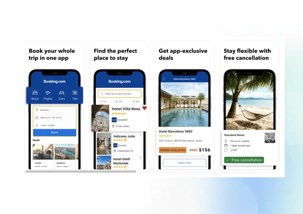
Booking.com’s mobile app offers a highly streamlined booking process, ensuring a user-friendly experience for travelers. The app provides an intuitive interface allowing users to search for accommodations, flights, rental cars, and activities effortlessly. With a few taps, users can browse many options, view details, check availability, and make secure bookings in real time.
Optimizing a travel platform for mobile devices is necessary to cater to most users and ensure a competitive edge in the digital landscape. Here are some best practices to achieve this goal:
- Implement responsive design. Utilize responsive design principles to ensure your platform adapts seamlessly to different screen sizes and resolutions, providing a consistent user experience across desktops, tablets, and smartphones.
- Prioritize mobile-first design. Start the design process by focusing on the mobile user experience, ensuring that the most critical features and content are optimized for smaller screens. Then, scale up to more extensive devices, maintaining a cohesive design.
- Adapt touch-friendly controls. Design buttons, links, and interactive elements with touchscreens in mind, ensuring adequate size and spacing for easy interaction on mobile devices.
- Optimize forms for mobile. Simplify and optimize forms for mobile devices by minimizing the number of fields and utilizing input options conducive to mobile typing, such as dropdown menus and date pickers.
Simplify the booking process
Lengthy and complicated booking forms can discourage users from completing their reservations. Simplifying the booking process is critical in designing a travel platform to enhance user satisfaction and increase conversion rates.
Here are some tips that can help you achieve a streamlined booking process:
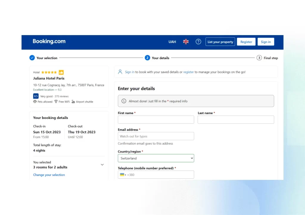
- Progress indicators. Use progress bars or indicators to show users the stages of the booking process, helping them understand the steps required to complete the booking.
- Minimal steps. Keep the booking process as short and concise as possible. Minimize the number of steps and form fields to reduce user fatigue and friction.
- Pre-filled information. Pre-fill fields with known information, such as dates or user details, to save users time and effort.
- Visual confirmation. To avoid errors, provide visual proof of selected options and choices before users proceed to the next step.
- Clear call to action. Have a prominent and clear “Book Now” or “Reserve” button on every page to guide users to initiate the booking process.
- Flexible dates and options. Allow users to easily modify dates, accommodation types, or other preferences without having to start the booking process from the beginning.
- Transparent pricing. Clearly display the total cost, including taxes and fees, to prevent any last-minute surprises for users.
- Guest checkout. Allow users to book without creating an account, offering a guest checkout option to reduce friction and encourage quick bookings.
- Integration of secure payment gateways. Integrate trusted and secure payment gateways to build user trust during the payment process.
- Help and support. Offer readily accessible customer support or help sections to assist users if they encounter issues during the booking process.
Booking.com has mastered simplifying the booking process, enhancing user satisfaction.
Incorporate predictive search and filters
By implementing predictive search and user-friendly filters, you can empower users to swiftly find their desired travel options, making the booking process efficient and enjoyable on your travel platform.
Here’s how to effectively integrate an efficient search and filtering system:
- Autosuggest functionality. Implement an autosuggest feature in the search bar, providing real-time suggestions as users type their query based on popular searches or previous user behavior.
- Recent searches and history. Display a list of recent searches or search history, allowing users to easily repeat or modify previous queries, saving time and effort.
- Location-based suggestions. Incorporate location-based suggestions to help users quickly find destinations, airports, or nearby attractions related to their travel plans.
- Visual presentation. Accompany predictive search results with images or icons for a visually appealing and informative search experience.
- Hierarchical structure. Organize filters in a logical and hierarchical structure, allowing users to select broad categories and narrow down their choices.
- Multi-selection capability. Users can select multiple filters simultaneously, enabling a more refined search and better alignment with their preferences.
- Clear filter labels. Use clear and descriptive labels for filters to convey the filtering options accurately and help users make informed choices.
For example, Expedia employs a straightforward and intuitive search bar, allowing users to input their travel details easily. The well-organized filtering options enable users to refine results efficiently based on price, duration, and more.

Add personalization
Personalization is pivotal in enhancing the user experience on a travel platform. It involves tailoring the platform’s content, suggestions, and interactions to align with individual users’ preferences, behaviors, and past interactions.
By implementing these strategies, a travel platform can provide a highly personalized experience, making users feel understood and valued, ultimately leading to increased engagement, customer satisfaction, and loyalty.
Below, we share some practical tips on how to leverage personalization for upselling and elevate the user experience:
- Comprehensive user profiles. Collect and maintain detailed user profiles encompassing preferences, behaviors, demographics, search history, booking patterns, and more.
- Behavior analysis. Analyze user behavior in real-time to understand their actions, interests, and intentions. Use this analysis to offer relevant recommendations and personalize the user’s journey.
- Machine learning and AI. Employ machine learning algorithms and AI to process vast amounts of user data, enabling accurate predictions and personalized suggestions.
- Segmentation. Segment users into meaningful categories based on behavior, demographics, or preferences. Tailor recommendations and content for each segment.
- Predictive analytics. Utilize predictive analytics to anticipate user needs and preferences, suggesting options that align with their likely choices.
- Dynamic content display. Dynamically adjust the platform’s content, including banners, pop-ups, and promotions, based on user behavior and preferences.
- Location-based personalization. Utilize geolocation to provide personalized recommendations for nearby attractions, restaurants, and activities, enhancing the user’s travel experience.
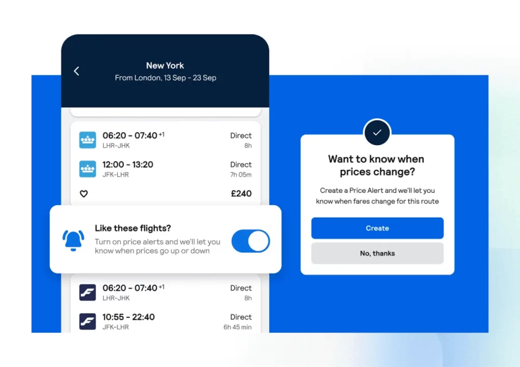
- Real-time updates. Provide real-time updates and notifications to users based on their actions, such as price drops for saved trips or limited-time offers for searched destinations.
For example, Skyscanner offers personalized flight and hotel recommendations based on user search history and preferences. They also provide alerts for price drops and exclusive deals on flights and accommodations.
Incorporating these tips and tricks into your travel booking platform design can significantly elevate the user experience and ultimately contribute to the success of your platform.
Alternative Spaces’s Travel Booking Platform Design Expertise
Our company has considerable experience in travel booking service development.
TravelBid.com, a booking platform tailor-made for travelers in Cyprus, is an example. Its unique value proposition rested on the seamless booking of exclusive deals and personalized offers not readily available elsewhere. Moreover, it provided a valuable avenue for local travel and hospitality enterprises to present special offers during off-peak periods without disclosing rates below the market average on widely used booking platforms like Booking.com or Expedia.
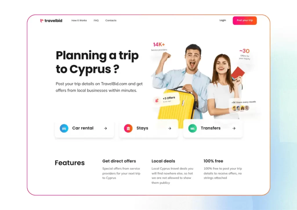
In designing a remarkable travel booking platform, the Alternative Spaces team began with a careful study of the client’s needs and preferences, setting the stage for an exceptional UX and UI design.
Drawing inspiration from major industry players like Airbnb, Booking.com, and Trivago, the objective was to streamline the platform’s user flow for optimal convenience.
The design team implemented creative solutions to enhance user-friendliness. Notable improvements included breaking down the inquiry form into manageable steps, presenting inquiries as informative cards on the ‘My Inquiries’ page, and providing comprehensive details on offers while displaying traveler requirements on the ‘Offer Details’ page.

Additionally, we curated a mood board, and after client approval, the team meticulously developed the UI design, focusing on a clean, light design with key elements accentuated by vibrant colors and gradients.
The transition to mobile browsers was seamless, ensuring an optimal user experience across devices.
Through iterative design iterations, the team successfully crafted a visually appealing and highly functional platform, culminating in a unique and recognizable logo that epitomized the essence of their exceptional travel booking service.
One more example of our travel app design is TRVLPAGE. The driving philosophy behind this design solution was to make the trip planning and sharing process enjoyable and effortless.
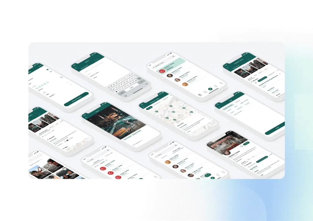
One of the standout features of TRVLPAGE is the careful balance between emphasizing primary functionalities and giving due attention to minor details. We prioritized key aspects of trip planning while also considering the minor elements contributing to a superior user experience. This balanced approach ensures that every part of the interface aligns with the users’ objectives without any hindrances.
A core principle in the design process was to ensure that no interface element hinders users from achieving their main goal — whether it’s booking a flight, finding accommodation, or creating an itinerary. Every design choice, from color schemes to button placements, was meticulously crafted with the user’s journey in mind. The aim was to eliminate any potential friction points and create a smooth and intuitive user flow.
Summing Up
Tailoring the user experience, optimizing for mobile, prioritizing speed, simplifying the booking process, and integrating predictive search and filters are all crucial elements contributing to a successful travel platform.
By applying the insights shared in this article, you can craft a platform that facilitates seamless travel planning and transforms each booking into a memorable adventure.
Designing a travel booking platform combines artistry, empathy, and technological prowess. It’s a process that demands an in-depth understanding of user behaviors, market dynamics, and the desire to offer a seamless booking experience.
If you are planning to make a design for a travel booking platform and require professional assistance, feel free to contact us.
FAQ
- How much time does it take to design a travel booking platform?
The time it takes to design a travel booking platform can vary significantly based on several factors, including its complexity, features, scale, team size, development approach, and the project’s specific requirements.
Generally, a ballpark estimate for designing and developing a travel booking platform could range from six months to over a year. Still, conducting a detailed analysis of the specific project requirements is essential to provide a more accurate timeline.
- What goes into the cost of designing a travel booking platform?
Factors like platform complexity, design requirements, development resources, technology stack, platform features, testing, regulatory compliance, scalability needs, ongoing maintenance, and the geographical location of the development team influence the cost of designing a travel booking platform.
To obtain an accurate cost estimate, it’s essential to define the project scope and requirements, collaborate with a development team, and conduct a thorough analysis based on the above factors.
- How can I ensure mobile responsiveness for my travel booking platform?
To ensure mobile responsiveness for your travel booking platform:
- Use responsive design principles.
- Prioritize a mobile-first approach in design.
- Implement CSS media queries for various screen sizes.
- Test rigorously across different mobile devices.
- Optimize images and multimedia for mobile performance.
- Design touch-friendly controls and navigation.
- Prioritize essential content visibility on mobile screens.
- Optimize website performance for faster loading on mobile devices.
- Focus on intuitive mobile user experience (UX) design.
- How can Alternative Spaces help in designing a travel booking platform?
Alternative Spaces, as a technology company, can assist in designing a travel booking platform by offering a range of services and expertise. Here’s how we can help in designing a travel booking platform:
- Consultation and Requirements Analysis. We provide consultancy services to understand your needs, goals, and target audience for the travel booking platform. This analysis helps in defining project requirements and objectives.
- Custom Development. Our specialists develop a custom travel booking platform tailored to your requirements, incorporating features such as flight and hotel search, booking, payment integration, user profiles, reviews, and more.
- Responsive Design. Alternative Spaces can implement responsive design principles, ensuring the platform is optimized for various devices, including desktops, tablets, and mobile phones, to provide a seamless user experience.
- User Experience (UX) Design. We focus on designing an intuitive and visually appealing user interface (UI) to enhance the overall user experience, making it easy and efficient for users to book travel services.
- Integration of APIs and Third-Party Services. Our experts integrate APIs and third-party services such as payment gateways, maps, weather information, and more to enhance the functionality and features of the travel booking platform.
- Security and Compliance. Alternative Spaces ensures the platform complies with industry regulations and follows best practices in security to safeguard user data and transactions.
- Scalability and Performance Optimization. We design the platform to be scalable, ensuring it can handle increased traffic and growth. Performance optimization techniques will be applied to enhance loading times and responsiveness.
- Continuous Improvement and Iterations. The Alternative Spaces team offers continuous improvement and iterations based on user feedback and changing market trends, ensuring the platform evolves to meet evolving needs and expectations.
Collaborating with Alternative Spaces can streamline the design and development process, leveraging our expertise to create a robust, user-friendly, and feature-rich travel booking platform.
Content created by our partner, Onix-systems.
Source: https://onix-systems.com/blog/how-to-design-a-travel-booking-platform Home
Home