Mobile App UI Design: Guide for Designing User Interface in 2023
Today’s market is flooded with various mobile apps, so it becomes increasingly difficult to attract people and keep them engaged. Modern users have exceptionally high functionality, interactivity, and visual usability demands. This is why it’s important to devote particular attention to mobile app UI design.
With that in mind, we’d like to shed more light on mobile UI design’s importance and share our thoughts and expertise based on Alternative-spaces’s experience designing custom UI/UX for mobile apps.
Table of contents
- Why is it important to create a custom UI design for your app?
- Creating an adequate user interface design for Android and iOS
- Mobile UI design principles
- Top mobile app UI designs
- How we design the compelling mobile user interface: Alternative-spaces’s tips
- The best mobile app UI design tools we recommend
- Alternative-spaces is ready to become your reliable design partner
- Final words
- FAQ
Why is it important to create a custom UI design for your app?
The mobile app user interface is the first thing your users will see. A poor user interface can easily make users abandon your app, devalue your brand, and, as a result, hurt your revenue. So, UI is not just a minor component of design, but it’s actually a crucial part of product strategy.
Let’s look closer at some compelling reasons for creating a custom UI design for a mobile app:
- Better user acquisition, engagement, and retention. A well-designed UI increases engagement by making it easier for users to find what they’re looking for and complete tasks without getting frustrated or overwhelmed with too much information at once. Keeping people engaged for longer periods encourages them to return often, thus increasing the retention rate over time and improving loyalty towards the product/service being offered.
- Enhanced brand image. An attractive UI gives off a strong sense of professionalism that reflects positively on the brand and customers’ overall opinion of it. Ultimately, good UI design helps businesses create an impressive identity that stands out against competitors in their respective market space.
- Increased efficiency. With user-friendly interfaces, users become accustomed to navigating your app quickly and easily, which leads to increased efficiency when utilizing it. UI designers ensure that all components are logically placed within the mobile application to streamline the user’s experience and make interactions quicker and smoother.
- Customer satisfaction. UI design can provide a better user experience by making the interface more intuitive and easier to navigate. Visual cues allow users to quickly identify each screen’s purpose, menu navigation options, and other essential features without having to read through long blocks of text. This makes for a more enjoyable interaction with your mobile application.
- Reduced development time and cost. App UI designs increase efficiency in product development cycles as it removes time-consuming tasks that would otherwise be required to create usable software interfaces. Additionally, good UI design protects against errors since it ensures that users don’t get confused or stuck when using an interface.
As you can see, mobile app UI designers have much to offer in terms of tremendous benefits for your business and end users alike.
Usually, our clients need their apps to be available on the Apple App Store and Google Play Store, so we design for multiple platforms. Each platform has its nuances that you should consider when designing an app. The following chapter should give you an idea of the peculiarities of designing a mobile app user interface for Android and iOS.
Creating an adequate user interface design for Android and iOS
Developing a UI design for both Android and iOS can be tricky, as their platforms have their own peculiarities. Let’s dive deeper into the details.
iOS app design
iOS requires a particular set of design considerations that must be considered when creating an appealing and intuitive user experience. Here are these subtle nuances of iOS app user interface design:
- Human Interface Guidelines. One of the most critical aspects of iOS app design is understanding the platform’s Human Interface Guidelines. These guidelines provide designers with essential information that should be taken into account when designing a user interface, such as how the app should look, how users interact with it, and what features it should have. Additionally, the guidelines help ensure a unified look and feel across all iOS apps.
- Device’s unique features. When creating an iOS app, designers must also consider the device’s unique features, such as touch-based displays and gestures. Mobile UI designers must consider how users will interact with UI elements through taps, swipes, double taps, pinch-to-zoom gestures, etc., as well as how each interaction translates into meaningful user experiences. It’s crucial to keep in mind that the number of visuals used on a page should be kept to a minimum so as not to overcrowd or overload the user’s experience.
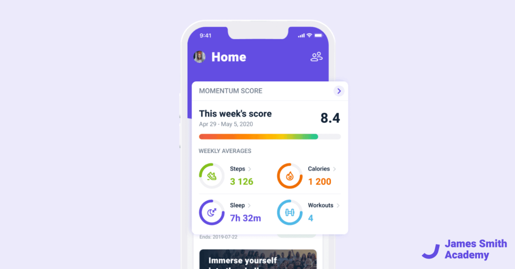
- Apple’s design principles. Designers should also consider Apple’s design principles when creating a UI for iOS apps. These principles state that designers should prioritize clarity over ornamentation and content over decoration when developing an interface. Designers must utilize hierarchy when laying out content on each page—ensuring that relevant information appears first while still avoiding clutter—and focus on typography which can lend depth and personality to an app’s design language. It is also important to ensure that the form follows function; i.e., each UI element has a purpose and serves its intended function without adding unnecessary complexity or confusion for users.
Android app design
Designing UI for Android poses a slightly different challenge. While iOs relies on minimalism, Android leans more towards uniqueness with vibrant colors as part of its brand identity. But this is not all the peculiarities. Let’s explore more aspects of Android app design:
- Support for multi-screen sizes and device topology. Android OS is made up of Android devices from different manufacturers, each having its own characteristics. Android apps must also be designed to work on Android devices with different screen sizes, aspect ratios, and resolutions. Even within the same device type, various UI elements can have drastically different implementations across Android versions.
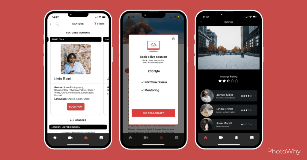
- Android Material Design. This comprehensive guide provides a foundation for creating consistent user interfaces across Android devices. It contains guidelines for designing typography, color palettes, icons, grids, and more to create an organized visual hierarchy. This helps ensure that your app looks great regardless of the Android device it’s running on. However, Android developers must still consider the differences in hardware between Android devices when designing their apps’ UIs.
- Typography. When designing an Android UI, pay attention to your text’s readability. Small-size fonts don’t make for a pleasant reading experience on small screens, so choosing font types and sizes carefully is important for maximum legibility. Additionally, consider how different orientations will affect the layout of your app. Many Android apps look best when used in portrait mode but offer additional features in landscape mode, which should be accounted for during the design phase.
- Buttons. Android designers should also pay special attention to buttons. They should be easy to tap without accidentally tapping other areas of the screen instead, especially on smaller screens. Additionally, familiarize yourself with native Android components such as notifications and pull-to-refresh gestures so you can incorporate these into your designs properly – they’ll add a layer of polish that users won’t miss!
All this said, creating an excellent user experience in apps that work flawlessly both on Android and iOs is possible when considering all platform specifics and requirements.
Mobile UI design principles
User interface design principles are common sets of guidelines used by UI/UX designers to create user-friendly, intuitive, and aesthetically pleasing interfaces. These principles help to create consistent product experiences across different platforms, devices and use cases. The most common UI design principles include:
Usability
UI designs should be easy to understand and use, featuring minimal complexity or confusion. This includes creating obvious navigational paths, clear labels, and logical groupings of elements on the page.
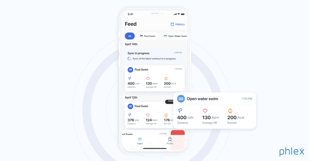
Below you can see an example of how our designers created a simple and intuitive feed for a swimming tracker app. The Alternative-spaces specialists made an easy-to-use swimmer’s log of activities to show swims in chronological order. We provided access to users’ training history with the ability to view related stats. Moreover, we combined the tab of calendar activities with the swimming history to filter swims by date conveniently.
Visual hierarchy
A UI should make important information stand out from the rest of the content so that users can easily find it without getting overwhelmed by too much visual clutter in one area of the screen. This can be achieved through contrasting colors, typographic styles, size differences, spacing between elements, and other visual cues, making sure important information stands out while secondary information takes a backseat, visually speaking.
Responsiveness
UIs should be responsive to different device sizes and input interactions (such as touch). Responsive design techniques allow a mobile application to adjust its layout accordingly so it looks good no matter what device is viewed.
Consistency and uniformity
This involves keeping the same look and feel across all parts of an interface by using similar colors, fonts, and iconography. Keeping these elements uniform helps prevent confusion and allows users to navigate around the application more easily. It also improves recognition of existing features, so users don’t need to relearn how to use a particular part of an application each time they visit it.
Minimalism
UIs should focus only on the essential elements required to complete a task. Any additional bells and whistles can add confusion. Remember that every component you add has an associated cost — not just in terms of time and money but also cognitive load. So it’s vital to prioritize carefully which features are necessary and which can be dropped altogether or added later once the core functionality is complete.
Top mobile app UI designs
In this chapter, we prepared a list of the most popular market giants and their amazing UI design solutions. Let’s consider how these popular apps provide some features that stand out from their variety of similar offerings.
Airbnb
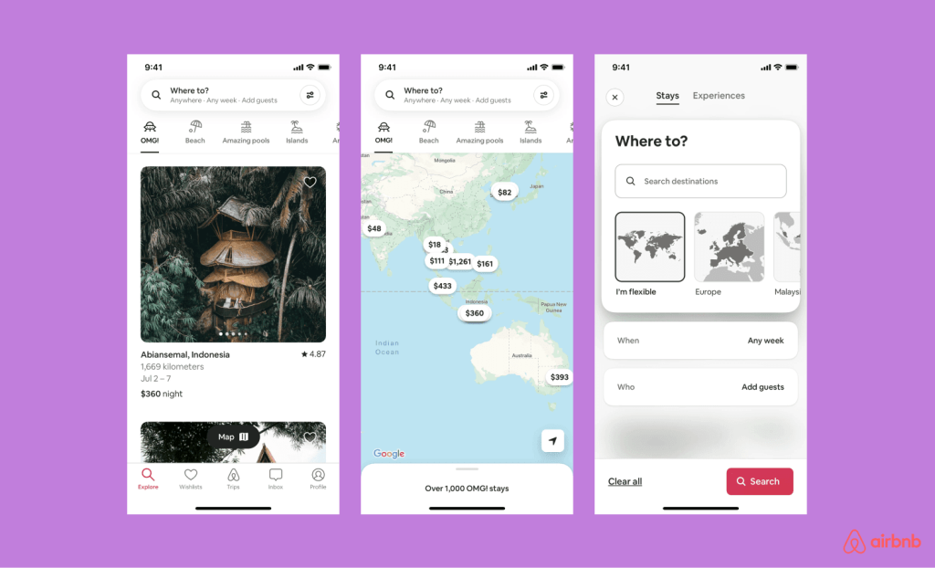
One example is Airbnb’s mobile app. It has a clean interface, easy-to-use navigation menus, and quick access to all the features users need when booking accommodations or looking for activities in their area. The comprehensive search function provides precise results, making it hassle-free for users to find their ideal destination quickly.
Slack
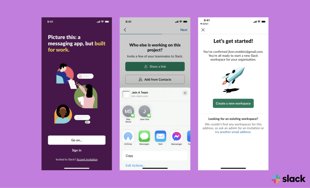
Another excellent example of a well-designed UI is Slack’s mobile messaging app. It has an intuitive design featuring helpful menus and notifications that alert users if someone sends them a message or mentions them as part of a conversation thread. Chats also offer menu options that allow users to set reminders, mute conversations, and more.
Spotify
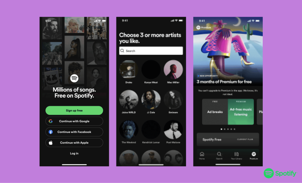
Spotify’s streaming music platform also deserves mention here. Its attractive interface allows users to easily browse through its library of tracks while giving them quick access to playlists created by friends or curated by Spotify itself. Navigation menus at the bottom make it easy for users to switch between different sections, such as Top Charts and Discover Weekly, without much effort.
Finally, Instagram’s social media platform also boasts an impressive UI design that makes interacting with other members easy via posts, stories, comments, and more. Instagram uses recognizable icons across platforms, so navigating through the app comes naturally regardless of device type or OS version being used. Additionally, Instagram offers personalized recommendations based on user preferences and usage patterns, making it easier for people to easily discover content relevant to their interests via its Explore section.
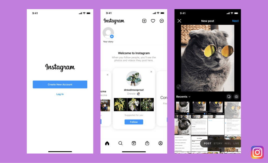
As you can see, there are numerous apps with well-designed UIs that make getting tasks done on your device faster and easier than ever before. From planning trips, managing conversations, or discovering new music, each offers a unique experience tailored specifically towards its target audience.
How we design the compelling mobile user interface: Alternative-spaces’s tips
Our designers created a list of our top mobile app design tips that are essential to ensure users have the best possible experience. Using these tips, we provide our clients with innovative design solutions that focus on usability, accessibility, and engagement as well as aesthetics and functionality. Well, how to design a mobile app UI?
Understand your audience
Knowing who your target audience is and what their needs and preferences are can be vital in creating a successful app design. Considering device type, operating system, user behavior, and other factors can help you create a tailored experience that caters to your demographic.
Don’t overload the user
App design should limit distractions by providing only relevant information to each screen of the application rather than overwhelming users with too much information at once, which could lead to confusion or multitasking difficulties due to cognitive overloads.
Optimize an app for different mobile devices
App design should be optimized for mobile devices, considering their smaller screens, limited processing power, and battery life constraints. Make sure all functions can be done with one hand, incorporate gestures or voice commands into navigation whenever possible, and optimize for portrait and landscape orientations if needed.
Keep it intuitive
App design should make it easy for users to find what they need quickly and without confusion. Avoid unnecessary complexity and provide clear directions on how to use the app.
Prioritize aesthetics
App design should remain visually appealing while still keeping its primary focus on usability and accessibility to ensure that users will return time after time (and recommend it to others). App designs should include colors that create an emotional connection with the intended audience and simple but effective visuals such as typography or illustrations.
Such visuals help guide users through the app’s functions seamlessly while pleasantly grabbing their attention rather than distracting them from essential tasks within the application itself.
Consider usability
App design should focus on usability as well as aesthetics. Usability testing can help you to ensure that buttons are in the right place, help text is clearly written, touch targets are sized appropriately, etc., making sure that users can quickly complete tasks within the app without frustration or confusion.
Additionally, consider integration with other apps like social media or messaging services so users can easily share content from within your app without leaving it entirely.
Integrate analytics tools
App designs should integrate analytics tools like Google Analytics or Flurry to track user interactions within an app. Based on user feedback, you can see what areas may need improvement or what features to implement to keep users engaged and coming back for more.
The best mobile app UI design tools we recommend
The design of mobile applications involves a lot of planning, design, and implementation. With the right design tools, you can focus entirely on design, making development faster, easier, and more efficient.
When it comes to the best design tools for mobile apps, there is no one-size-fits-all answer. Each designer should choose the tool that meets their needs best. That said, some design tools have become popular choices for mobile app design projects due to their ease of use, cost-effectiveness, and powerful features. Here they are:
Sketch
Sketch is a popular choice among designers because of its flexibility in quickly creating high-fidelity designs with its plugins system allowing designers to add new features to the product as needed. It also provides custom vector graphics making it easier to create complex illustrations or logos out of multiple layers or shapes that suit design requirements perfectly.
Figma
Another popular design tool is Figma which provides an all-in-one platform with an intuitive interface designed to be used by teams. This makes collaboration easy with real-time editing capabilities and allows you to use libraries that include UI kits which are helpful when developing mobile apps. It also has version control so you can track changes over time and presentation tools that allow you to present your work visually.
Adobe’s XD
Adobe’s XD is a design software used to create prototypes for web, mobile, and desktop apps quickly and easily. It offers prototyping for voice interfaces such as Amazon’s Alexa and Photoshop integration. It also provides a variety of pre-made components, from icons to buttons, to give your project a quick start.
InVision Studio
InVision Studio is another powerful design tool offering advanced animation effects such as 3D transformations and physics engine simulations like gravity or motion blur. This makes designing interactive prototypes more straightforward than ever before. Furthermore, it offers detailed commentary features which help developers collaborate more efficiently among team members when working on projects remotely or in different locations worldwide at any given time.
ProtoPie
Finally, ProtoPie is an excellent choice if you’re looking for prototyping software specifically designed to create realistic interactive prototypes faster than other design tools available today. It enables users to easily add interactions between elements using triggers and actions without any required coding experience. This makes it a great choice for experienced designers who want to make their work even more impressive and beginners who don’t have much technical knowledge about development but need to create high-quality designs quickly and efficiently.
Alternative-spaces is ready to become your reliable design partner
Alternative-spaces’s mobile app designers have 22+ years of extensive experience designing various products for any business size worldwide: from travel startups and fitness apps to hybrid integration platforms and game simulators. Below you can see some examples of our designers’ work.
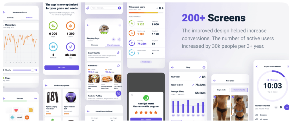
This is an example of how the Alternative-spaces team created a design for an online personal training platform. We helped our client to build a feature-rich fitness app that contains videos, images, and 3D models considering different user groups and levels of difficulty.
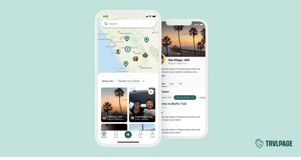
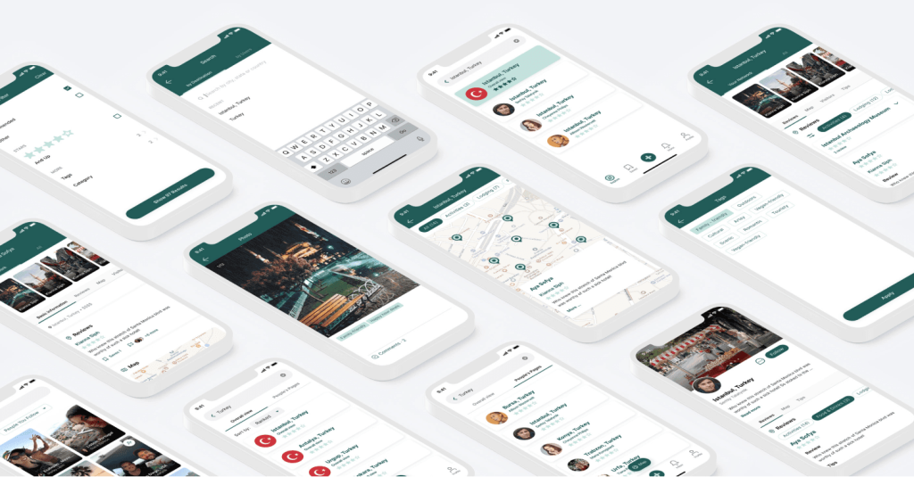
Here is an example of how we designed a travel mobile app. The app was created for strangers willing to travel and find out more places of interest with the help of local people who share their experiences. The design process included mapping, wireframing, prototyping, and elaborating a custom visual design. As a result, a thoughtful user journey, carefully arranged components to facilitate fluent interactions with the interface, and the unique visual style made finding a place to go and like-minded people to communicate with easy and engaging for each user.
Our design team understands UI/UX best practices and knows how to meet clients’ requirements and their target audience’s needs by delivering top-notch design solutions.
Delivering intuitive and delightful app design is our task #1. We conduct a careful analysis to put all design details in the right place. Our work is more than just an appealing design. We produce ground-breaking, problem-solving, and user-driven designs.
At Alternative-spaces, we provide a full scope of design services, from deep search analysis to full-cycle mobile design (iOS and Android). Below is a detailed look at our design services and examples of our work.
Final words
Creating an excellent UI design for an app isn’t only about making your product look good, although this is a critical component. It’s also about creating a user experience that is intuitive and easy to use. A great mobile app UI should be visually appealing but also provide users with helpful information quickly and efficiently. Think of it as a recipe – all the ingredients should work together harmoniously to create something special.
User interface app design is more than just drawing a product. Designing a great mobile app user interface is quite a difficult task. It takes knowledge of fundamental principles, the ability to solve users’ problems by providing intuitive navigation, and knowing how to gather and handle users’ feedback.
If you need advice or are looking for a professional team to realize your mobile app ideas — please contact us!
FAQ
Is outsourcing app UI design a good idea?
Outsourcing app UI design is becoming increasingly popular amongst businesses that are looking to reduce costs and maintain a competitive edge in the market. Outsourcing this kind of work to experienced professionals can be advantageous as they often have access to modern software, experienced designers, and specialized tools that may not be available internally. Furthermore, outsourcing offers businesses faster completion of projects without sacrificing quality or security.
What to avoid in UI design for mobile apps?
When designing a mobile app, there are a few common pitfalls to avoid. For example, oversimplifying navigation elements can lead to confusion and make it difficult for users to find what they’re looking for. Additionally, cluttering the interface with too many options or overloading the user with information can overwhelm the UX. It’s also essential to ensure that all visuals match the app’s functionality and avoid using overly complex color schemes or icons that can be visually confusing. Finally, taking cues from popular apps is not recommended, as it can lead to generic designs that don’t set your app apart from the competition.
What goes into the cost of mobile app design?
All design projects should start with goal analysis and market research. Based on the outcome of the initial goal and audience analysis, designers begin work on eye-catching wireframes to show a clear visual structure. The next stage is prototyping which allows designers to introduce important features and navigation. And finally, designers can add images and animations, app logos, icons, etc.
How much time does it take to design an app?
The time to design a mobile app depends on the project complexity, requirements, goals, hourly rates of the design agency, etc. For example, designing an MVP interface normally takes a few days. As for a more complex app like Uber, it can take 350+ hours for the design.
Content created by our partner, Onix-systems.
Source: https://onix-systems.com/blog/how-to-design-a-mobile-app-ui Home
Home