3 crucial features of today’s mobile app design

The number of app downloads keeps on growing non-stop. From 2015 to 2016, there has been a 15 percent increase in downloads with their total number reaching 90 billion and making the revenue of $35 billion for iOS and Android.
Beating the mobile app market with its more than 2 million applications is tough unless you have a great app to offer. When people download apps, they are looking to solve their daily problems easily – going shopping, sending emails, planning a trip, etc.
A great app means that you not only build a careful marketing strategy to let the world know about it, but actually offer an efficient product that solves problems. For a mobile app, efficiency means a well-programmed and tested software product and also very importantly, a thoughtful design.
In this article, let’s take a look at some of the design features that directly impact users’ comfort with mobile apps.
-
Simple and easy-to-use design
An app overloaded and packed with showy features has a great chance of immediately becoming a nonviable software product that users will not want to use. Simple things are always perceived easier and quicker. Simplicity in app design makes it instantly clear what it is about and what action a user has to take in order to make things happen. This requirement absolutely makes sense if you are looking to create an app that deals with large amounts of data and this data needs to be displayed to a user.
Only by presenting information in a simple format you can avoid user confusion and getting the app deleted. Poor navigation and usability are one of the top reasons for apps getting removed from phones. What is ok in terms of clicks and typing on a laptop is not ok on a smartphone. So the task is to keep the functionality as part of the design, but minimize the number of clicks a user has to make or fields to fill in in order to use the app.
Prior to beginning design of your app, a thorough research on user needs must be held. The best approach is to try and remove any extra features instead of trying to cram the app with more additional tasks that are not essential for the major goal of the application.
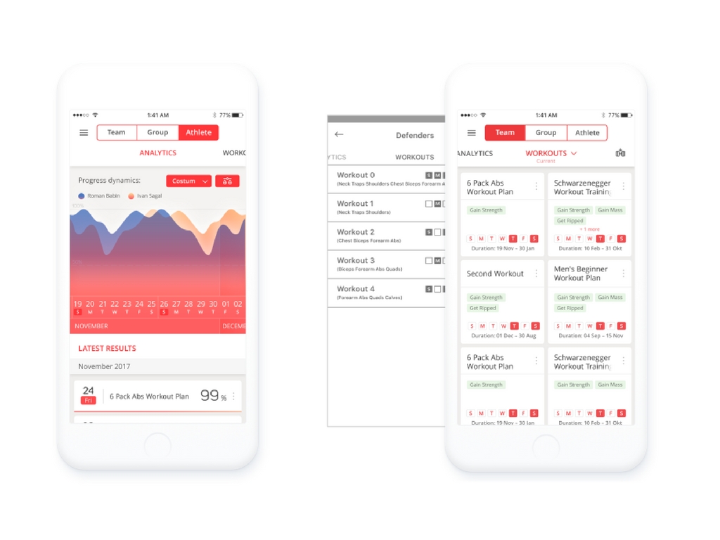
As an example, let’s take LiftSync app. Design for this mobile app that mostly exhibits metrics about sports progress and achievements of teams of athletes and each athlete individually was a tough task for our team of designers. The goal was to reflect all workout data while offering an excellent user experience. We worked to make UI as easy and clear as possible and to reduce the number of controls. We also tried to avoid using complex multi level elements.

We conducted testing to click through the future app and identify any extra steps a user had to make and potential difficulties. We repeated design testing several times and each time we cut down the number of controls, taps and implemented intuitive swipes where it was suitable. As a result, we were able to implement the project most effectively, within a set deadline and optimize each part of the product.
- Time saving design
Effortless and straightforward design that at first glance makes it clear how to use an app to get what you need adds more value to it. Users don’t need apps that require time to look around and try to understand how the app works. All they want to see is software that is quick, clear, useful and helpful to their need. Fast load time makes the app instantly accessible. Touch based features design and no extra functionality that could distract attention increase user experience satisfaction.
The key to creating the right design for your app is answering the question what goal your user is looking to complete through the app on their phone. It is essential to ensure easiness and comfort of using an app.
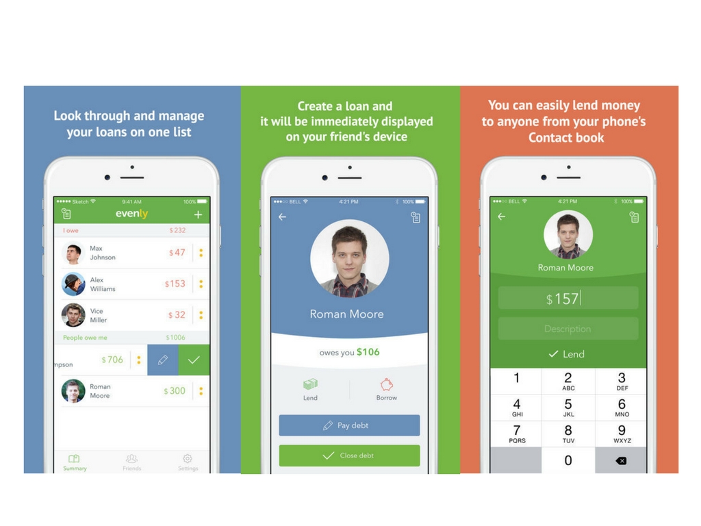
For example, Evenly is an iOS app that helps track a loan history, see who owes you money or how much you owe to someone. This app lets you easily enter loan amounts and resolve such a common problem as forgetting, especially if you owe a small amount paid for lunch. Our team created a rather laconic design that directs a user straight to the goal.

Entering loan information is quick and easy. The app collects names of people from your contact list on the phone and with one click you can take an action, either pay the amount you owe or cross out the loan from the list of debts. It’s fast and intuitive and contains only the functionality you need to solve one major problem with money.
-
App working offline as a feature
Enabling the app run while there is no Internet access offers extra usability and allows some additional comfort for a user who needs to get important information at a particular moment of time. This strategy is especially successfully implemented with travel apps. No matter where a user is, they can access maps or location photos while they are walking or traveling in an area that has no Wi-Fi or Internet.
Some apps may deal with sensitive data that requires protection, so it is important to remember that the offline feature requires good understanding of what parts of the application should work without Internet connection and be saved on the phone, without causing damage to some personal information.
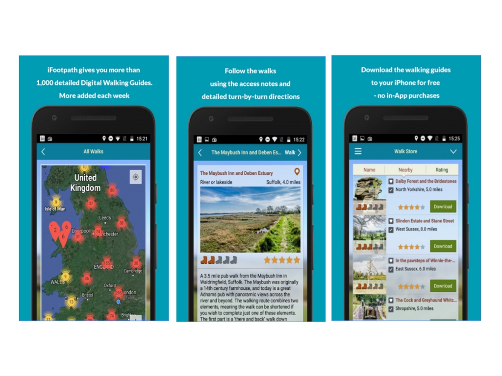
As an example, let’s take iFootPath, one of our projects that reflects this approach to mobile app design. iFootPath is a walking guide on the palm of your hand that provides more than 1,000 of mapped UK digital walking guides. The app offers beautifully presented guides for walkers and hikers with detailed instructions, notes and photos. Maps have GPS trail.

All digital walking guides from the store can be downloaded onto the phone, so a user can take a look at them any time they need. This feature facilitates their walk experience and helps stay independent of Internet connection.
As an owner of your own app, you may also consider adding a feedback system to collect user opinions about the app whenever they encounter something they don’t like in particular. Access to a support line will help you add improvements more effectively and without delay and you won’t have to wait for feedbacks on the app store.
Also, to get a better understanding of what your users do with the app, you can choose adding an analytics tool (Flurry, Google Mobile Analytics, Apple App Analytics) to receive real-time information about traffic, specific features users like, user behavior and make your app better and more useful.
Only by conducting regular evaluations to understand what users do in the app and adjusting design according to user preferences will help create a successful mobile app.
Content created by our partner, Onix-systems.
 Home
Home