 Home
Home9 Most Important Design Features of a Selling Ecommerce Website Architecture

Content, customer service, and marketing efforts are essential for ecommerce website conversion rates. Even more so is website design which specifically creates the right visual effect. Building a topnotch web design can bring great long-term dividends for your business.
Do you want your website to become a strong sales machine? Do you want to generate leads and quickly convert them into customers?
In this article, we are going to share 9 essential tips on ecommerce website architecture that will help you increase your sales.
Great ecommerce design is a must
A user decides whether to stay on a website or not within a split second. In less than 3 seconds they identify the key areas on a web page to finalize their first impression. A design builds credibility and usability. It determines whether a potential customer is going to be back again to the website or simply disappear.
Users evaluate colors, fonts, and visuals according to their personal preferences. An ecommerce website which follows some basic design and usability principles can turn your site into a powerful sales generator.
So how does one create a user-friendly website? Let’s see a certain ecommerce website features list that can lead to higher conversion rates for your commerce site.
1. Your buyer persona and content relevance
Understanding your buyer persona (gender, age, weight, wants and needs) is essential to a successful sales website design. It is better to create design and content which connects with a specific group of users and increases your chances to sell online successfully.
Customers can be broken into three groups according to their levels of needs:
1. people who have a problem and are seeking how to solve it
2. people who are comparing available options
3. people who have already decided to make a purchase
Your web design should address all of these needs.
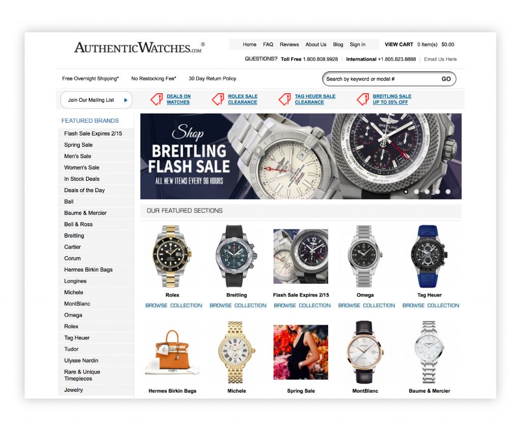
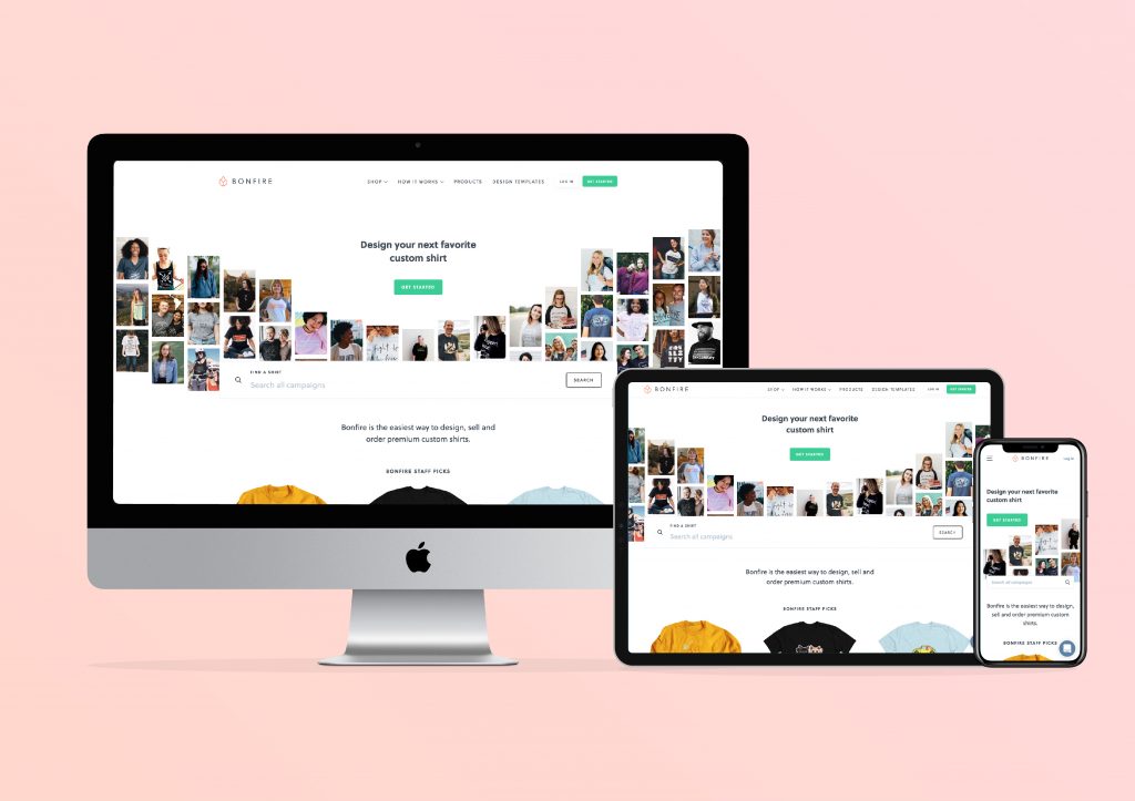
Example from https://www.authenticwatches.com
2. Product introduction
Visual information featuring details of the product (with your buyers’ reviews) gives a form of dual introduction of your goods:
1. the product itself
2. the product according to its actual value to a user.
Eye-catching photos and positive testimonials are indispensable in this process:
- Eye-catching photos
Your product image should not be borrowed from stock websites. They are easy to recognize and frequently turn away potential customers. Uploading real high-quality photos of your products is a must. Authentic, sharp images build trust and create a connection between your brand and customers.
- Testimonials
Placing customer testimonials, especially video reviews, will raise credibility with your potential buyers. Videos are regarded as “non-fake” and are more effective in reducing customer concerns.
Placing reviews is an essential ecommerce feature. Recommendations are now a part of our daily life, and people typically pay attention to them.
A study in the United States found out that 83% of consumers are more likely to purchase from a brand if it was recommended by family and friends. Placing reviews from people that match your buyer persona next to your product images is often very effective.
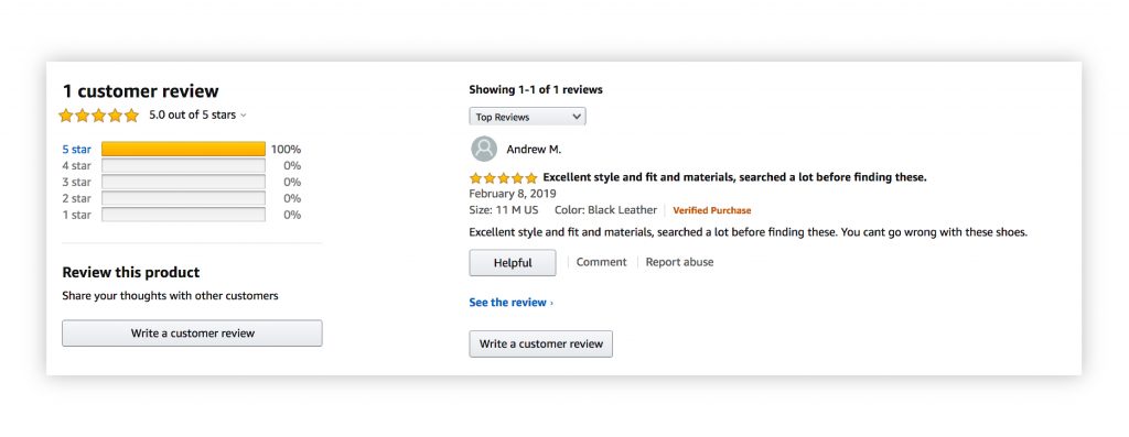
Example from https://www.amazon.com
3. Product search and categories
Fast and easy navigation through multiple products in an online store is crucial if you don’t want to confuse your customer. Adding a search engine and a neatly compiled product catalog allows users to compare products simultaneously. Overall, it speeds up their search on your website.
- Search
Adding a product search is a must-have for an ecommerce website. So, if your ecommerce store still has no search engines, it’s time to install them. Designing search options which include product images in the search bar may considerably increase your conversions. Here’re some tips for it.
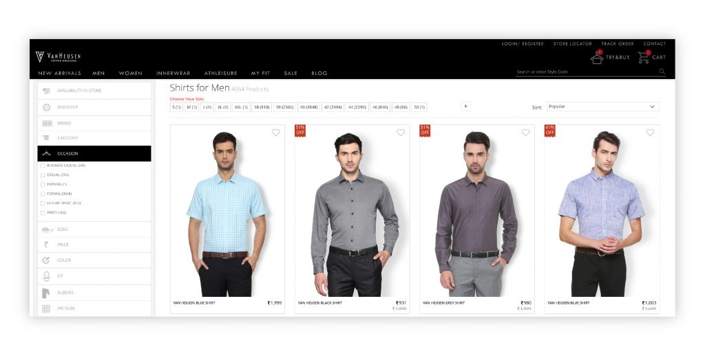
Example from https://www.vanheusenindia.com
- Comparison
If you have many products in the same range, it’s often hard to determine how each is different at first glance. Since users may struggle with remembering your product’s specific features it’s wise to add some comparisons. Comparisons should be easy to use. Otherwise, a visitor may become annoyed and leave the website without making a purchase.
For an overview of product similarities and differences of less than 10 products, choose a table or blocks with the headings. You could include bullet lists that are displayed on one page. To compare more than 10 products together, use a faceted search. Display the main characteristics of a product.
- Product categories and catalog
The main disadvantage of shopping on the Internet is that potential customers can’t see the actual product. They can’t take it in their hands to make a decision. You can improve convenience by creating category pages. Categories help to organize your content in a more user-friendly way. Thus, categories serve as an index for all pages based upon a particular subject. Additionally, you can design a product catalog with products that offer details about products featuring high-quality photos.
Top-level pages of an ecommerce website often contain product grids that demonstrate product categories. So the catalog can be implemented as graphic sub-category tiles to guide potential customers. It can make their search efforts relevant to their needs. Additionally, content blocks can be used to present a product catalog on a website as a mini-homepage that contains CTA and good imagery.
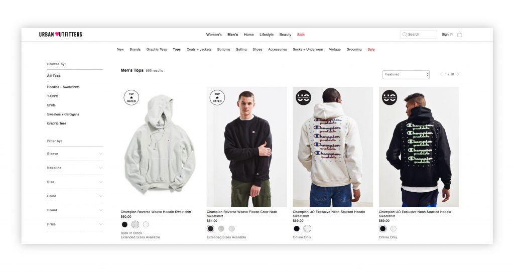
Example from https://www.urbanoutfitters.com
4. Purchasing & shopping cart
Another critical area on an ecommerce website is the purchase process. You can be more confident that a user liked the website once they reach the “place order” page. It’s vital not to scare a customer away with a confusing, complicated order form.
- Purchase process
A purchase is the result of a potential customer transitioning from having doubts to being certain. It’s presenting your brand as crystal-clear and helpful to a customer. Attracting a potential customer and showing visually that you can solve their problem is the foundation of a successful ecommerce site structure.
An online sales process is based on the quick introduction of your value proposition. It also includes designing an intuitive, simple process for placing an order. Your site should methodically take your client all the way to the shopping cart.
The whole process should be designed with the fewest number of steps to complete a purchase. Number each step which leads to a purchase and follows a pattern that users know (filling in the contact information, shipping, and billing details). Last but not least, don’t forget to include special offers which can help retain a new customer.
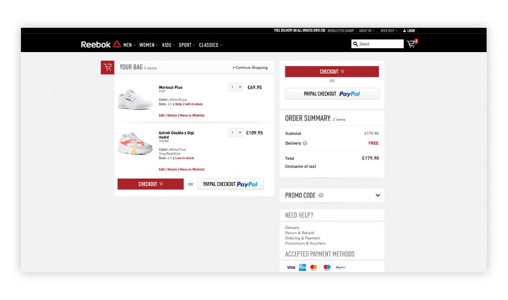
Example from https://www.reebok.co.uk
- Recently viewed products and similar products
So you don’t lose information about products that a potential customer looked for and to further remind them about those preferences, add a section of recently viewed products through the internal linking system of your site.
This option can simplify the decision-making process if a user decides to come back to the products they liked. Additionally, it’s helpful to add a list of similar products on a product page to provide more freedom of choice.
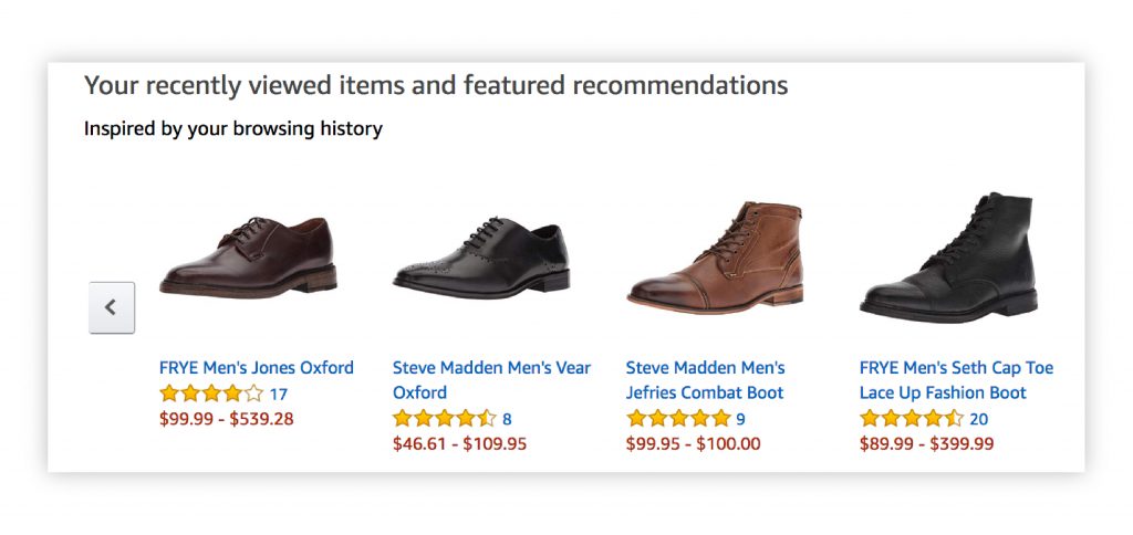
Example from www.amazon.com
5. Product page rules
Navigation through products creates real pain for customers if there is no strict organization of the types of goods offered.
- Filters
Too many options on a single page can overwhelm a user and they may give up or look for another website. If your store offers a large variety of products, simplify the process of choosing and decision making by adding filters that make a list smaller.
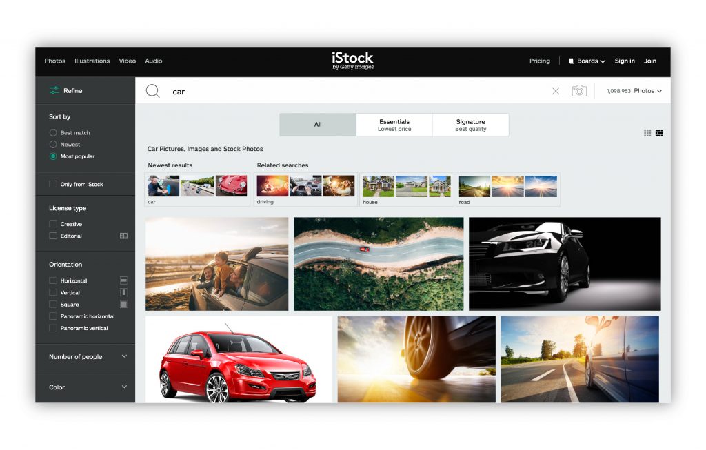
Example www.istockphoto.com
- Simple layout
Pages should be as uncluttered as possible. A user should understand what information is crucial and what details are secondary.
- A lean URL structure
The URL structure of your ecommerce site should flow naturally as well. It shouldn’t be very long (keep it below 70 characters where possible).
- Following the patterns
The rule of consistency in online sales web design is also vital. The first visit to a website is a new experience to a user. Certain patterns are typical for most ecommerce sites, such as a typical call to action (CTA) button location and menu structure. Experimenting with user experience is costly and time-consuming and may result in a confused user.
6. Call-to-action visibility
A prominent CTA (either a button or a registration form) is essential for achieving the goals of an ecommerce website. It guides a user to initiate action with your store. It is better to place CTA somewhere where it’s visible and easily accessible.
7. Special product pages
Product pages can emphasize a special kind of product. They can be a great way to familiarize a potential customer with all the product’s special characteristics including detailed images, price, reviews, and descriptions. These pages can help a user identify a need and how best to address it. Interactive sections provide additional examples of the product value and explain ease of use and the product’s benefits.
8. Using GIFs and video
- Product video
High-quality product images make an impact but product videos are even more powerful in driving sales rates. The human brain processes visual information 60,000 times faster than printed text. Product videos encourage users to stay on the website longer and encourage them to return.
- Animated images
GIF files are a great choice for animated design pieces on the home page or product category pages. They make images less boring and involve an action. At the same time, it is better not to use GIFs for product images where you want to let a user see more details.
9. Design with emotion
According to Donald Norman, the author of “Emotional Design”, customers tend to perceive things as useful if they look gorgeous. Web design can evoke both positive and negative emotions. Design perception depends on the customer’s gender and cultural background. Website design should appeal emotionally.
It is crucial to combine features on your ecommerce website that are in alignment with your personal brand vision and which stand out among other rival websites offering similar products or services.
Final thoughts
Perhaps the time has come to further optimize your ecommerce platform. Every ecommerce website can benefit from constant optimization and management. It’s always wise to double check your site. Ask yourself these questions: Does my website run properly? Does every page look exceptional?
We are here to give extra tips on how to achieve good ecommerce SEO with help of thoughtful design. Ultimately your website architecture could be the largest factor determining success or failure. Let’s work together to help your ecommerce store shine like a brand-new coin!
Content created by our partner, Onix-systems.