 Home
Home9 most important design features of a selling ecommerce website
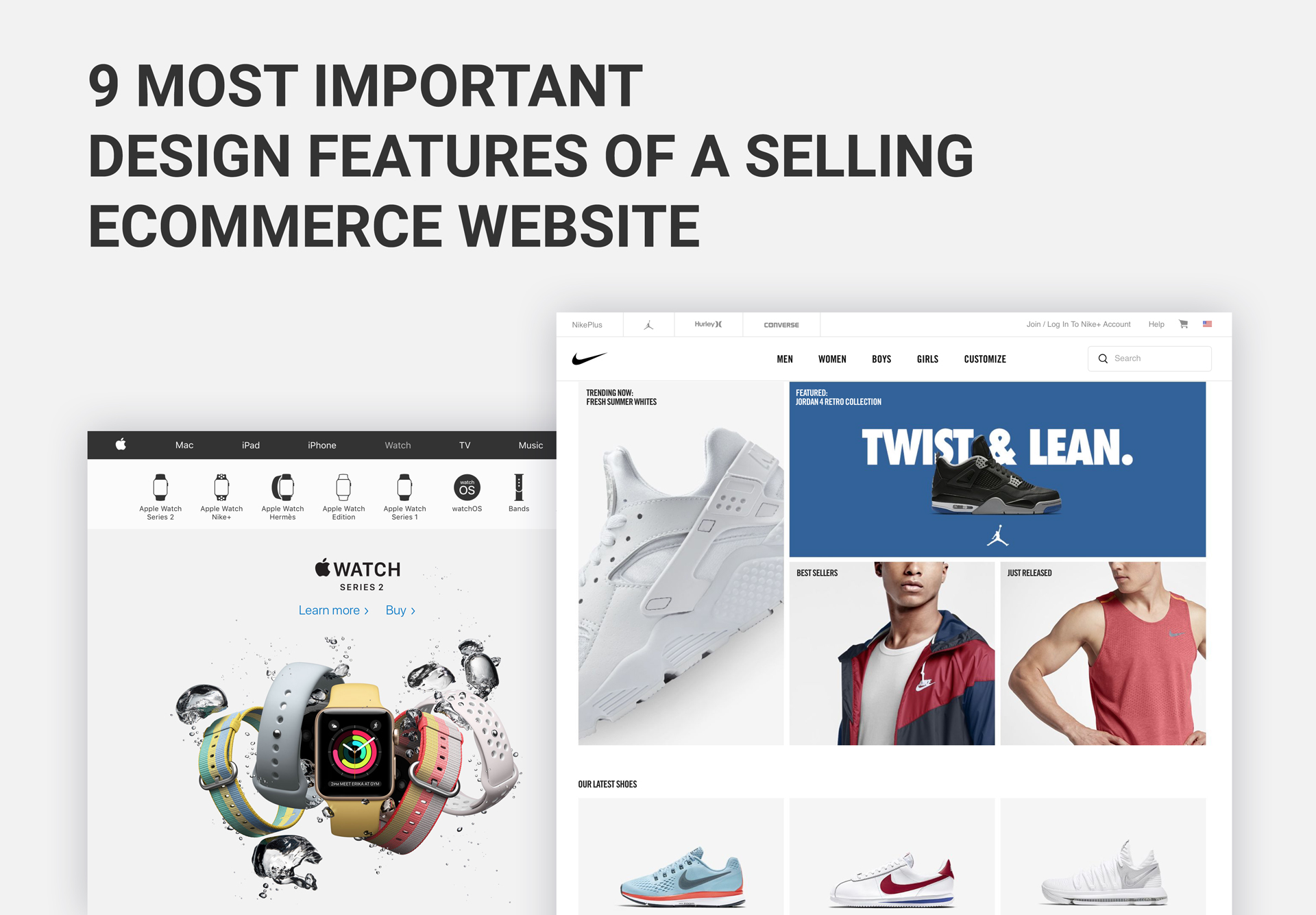
For ecommerce, a good-looking website is the foundation for success. Content, customer service and marketing efforts are important for an ecommerce website conversion rates, but design specifically creates the right visual effect. And humans are visuals, first of all. At the same time, building a beautiful website design and then abandoning it as it is for a long time is a sales crime.
It is only a website that corresponds to the current design rules that can become a strong sales machine, generate leads and quickly convert them into customers. Such giants as Apple or Nike would tell you that it is more effective to spend a big budget on design than hire a large sales team because good design always sells better any time of the day.
In this article our team of ecommerce website designers will share what a good ecommerce website design means and what design elements will help your website increase sales.
How great ecommerce design benefits sales rates
A user makes a decision whether to stay on a website in less than a second. In less than 3 seconds a user identifies the key areas on a web page to finalize their first impression. Design impacts the first impression for 95% of new-comers. It builds credibility, and usability in design determines whether a potential customer is going to be back again to the website in the near future. In this case content of a web page influences only 6% of users who are deciding whether the website is trustworthy and informative.
Colors, fonts and visuals are evaluated by users according to their personal preferences. An ecommerce website that is following basic design and usability principles and contains certain special features, turns into a sales generator.
Let’s see further what design principles are best utilized for sales website designs.
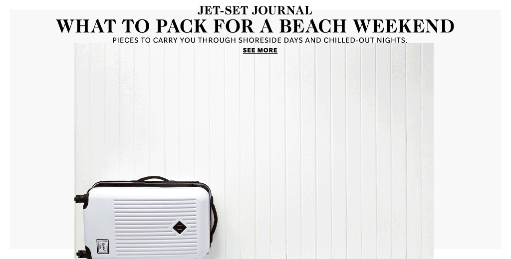
1. Your buyer persona and content relevance
Understanding your buyer persona (gender, age, weight, wants and needs) is essential to a sales website design. Targeting a specific group of users provides a greater chance that people will make a purchase on your website and won’t leave it because there is no straight logic and products are mixed together, and there is no clear suggestion for whom this store is.
At different stages of their journey on the website and according to their levels of needs, customers are broken into three groups: people who have a problem and are looking how to solve it; those who are studying available options and compare; and those who have decided that they will buy. It is important to remember about and make sure you web design solves these needs.
Understanding and focusing on your buying persona’s needs may help increase conversions up to four times.
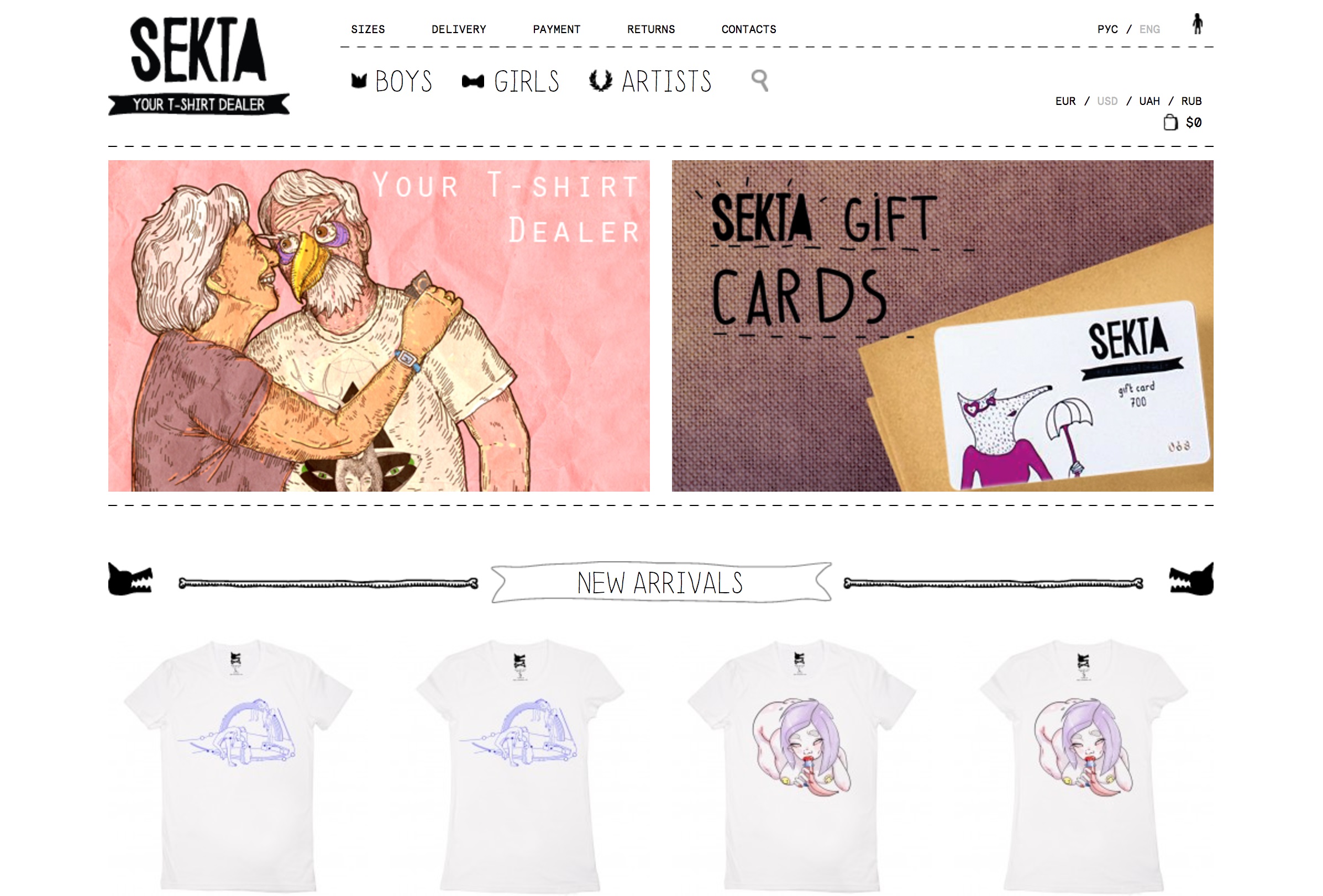
Example from www.sektashop.com
2. Product introduction
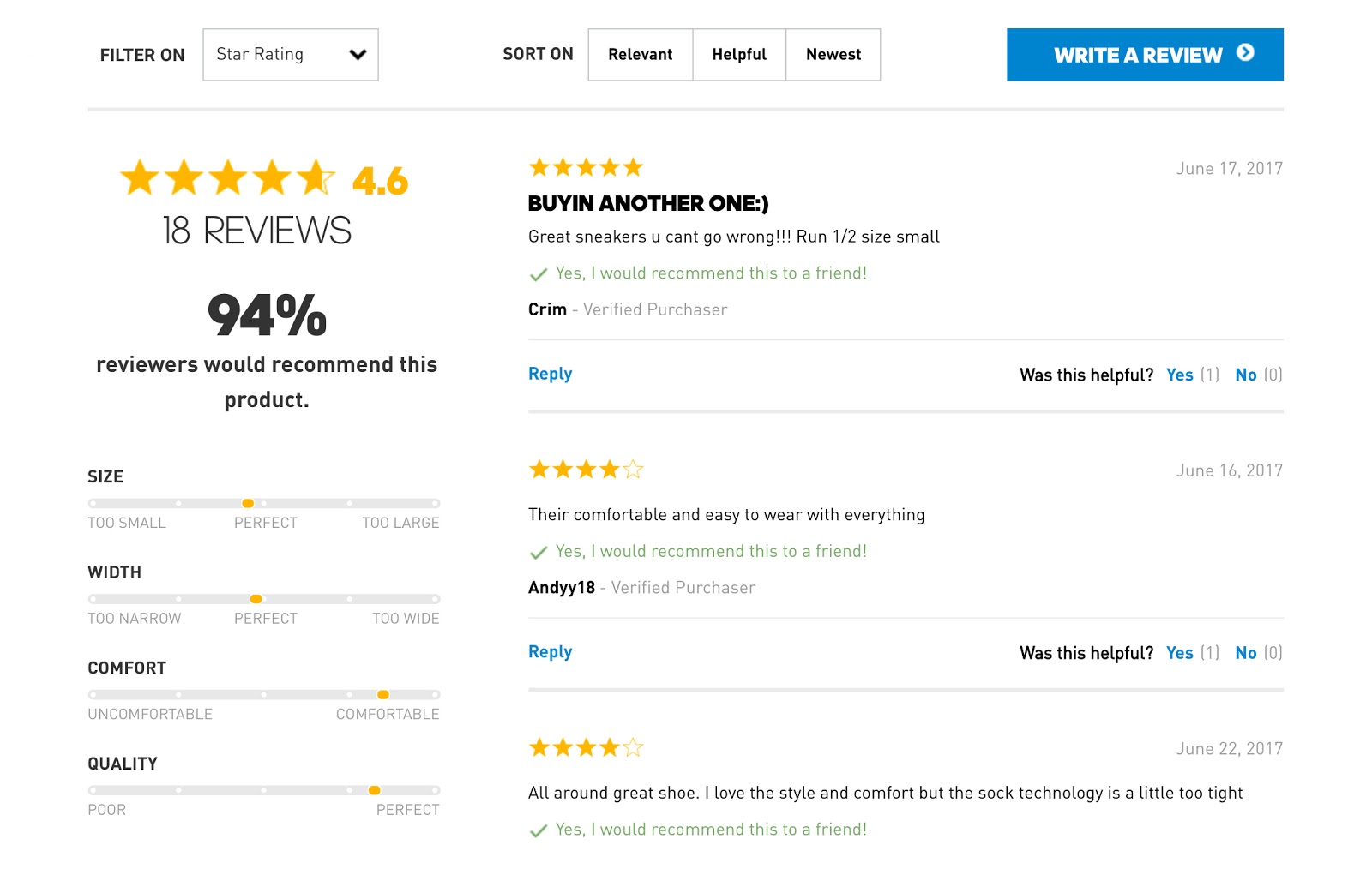
Visual information that shows a product in detail and includes reviews from your buyers introduces the product both from the point of view of a store and of its actual value to a user.
-
Good photos
On product pages there is no room for stock images. They are easy to recognize and frequently turn away potential customers. Instead it’s a necessity to place high-quality real photos of your products because authentic and eye-catching photos build trust, create connection between your brand and customers and thus help increase sales rates.
-
Testimonials
Placing customer testimonials, especially video feedbacks, will also help achieve better credibility with your potential buyers since videos are regarded as non-fake and are more effective in eliminating customer concerns.
The idea behind placing reviews is simple. Recommendations are part of our daily life and people typically pay attention to them. Our family, friends and colleagues share their opinions and 70% of people believe their experience. Placing reviews from people that perfectly match your buyer persona close to product images works the same.
Compared to reviews, ads earn only around 10% of trust among users. In sales adding testimonials means increasing sales up to 18%.
3. Product search and categories
A fast and easy navigation through multiple products in an online store is important if you don’t want to confuse your customer. Adding a search option, product catalog, and ability to compare several products lower a user’s efforts to find what they need and speeds up their search on the website.
-
Search
Adding product search is a must-have for an ecommerce website. So, if your online store still has no search, it’s high time to put it on your site. And designing search that includes product images in the search bar may boost your conversions up to 100%.
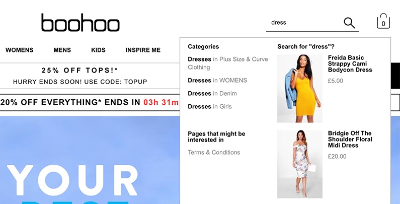
Example from www.boohoo.com
-
Comparison
If you have tons of products of the same range, it’s hard to determine how each of them is different at first glance and you realize that remembering their specific features to see the difference is impossible, go ahead with adding comparisons. Comparisons design should be easy to use; otherwise a visitor will get tired and most probably leave the website without making a purchase.
For an overview of product similarities and differences of less than 10 products, choose a table or blocks with the headings and bulleted lists that are displayed on one page. To compare more than 10 products together, use faceted search and display the main characteristics of a product. Utilize a detailed product comparison that summarizes all characteristics in a table.
-
Product categories and catalog
The main disadvantage of shopping on the Internet is that potential customers can’t see the actual product or take it in their hands before making a decision. You can improve credibility and help visitors understand what they need by designing a product catalog that offers details about products and high-quality photos.
Top-level pages of an ecommerce website often contain product grids that demonstrate product categories. In this case, a catalog can be implemented as graphic sub-category tiles in order to provide guidance to potential customers and make their search efforts relevant to their needs. Additionally, content blocks can be used to present a product catalog on a website as a mini-home page that contains CTA and good imagery.
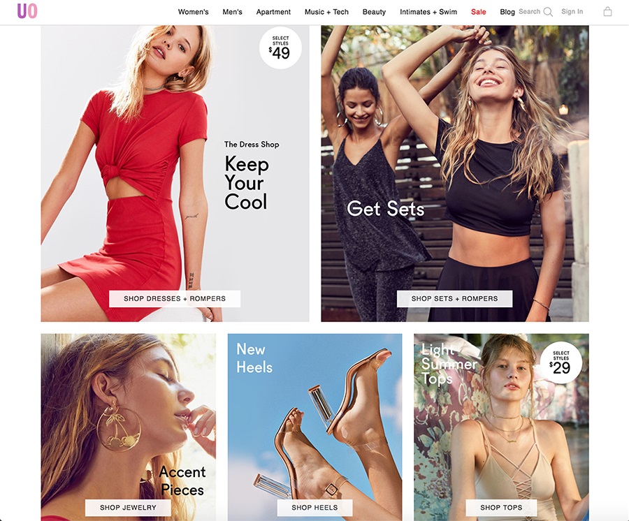
Example from www.urbanoutfitters.com/womens-clothing
Another most important area on an ecommerce website is the purchase process. Once a user reaches the page to place an order, you can be sure that they liked the website and trust it enough to buy something from you. The task of this converting step is not to scare a customer away by an unclear or too complicated purchase form.
-
Purchase process
If it is a product sales website design, the sales process should be included into every element of it. A purchase is a result of transitioning a potential customer from doubts to certainty and conveying your brand as understandable and helpful to a customer. Attracting a potential customer and showing visually that we can solve their problem is the foundation of ecommerce design.
An online sales process is based on the introduction of your value proposition as soon as possible. It also includes designing an intuitive and simple process of making an order. The whole process should be limited to the fewest number of steps to complete the purchase. Internet buyers are very impatient and expect the sales process to be easy and fast. Number each step that leads to a purchase and follow a pattern that users know (filling the contact information, then shipping details and billing), Additionally, consider adding the order tracking section to take care of those customers who are eager to know when their parcel arrives.
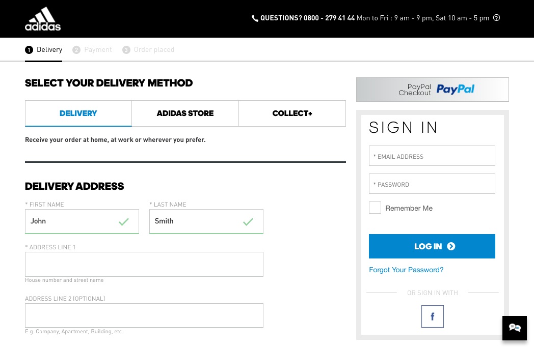
Example from www.adidas.com
-
Recently viewed products and similar products
Not to lose the information about products that a potential customer looked at and further to remind them about those preferences, add a section of recently viewed products.
At the same time, if your online store has tons of products, this option will simplify the process of making a decision once a user decides to come back to the products they liked. Additionally, you should consider adding a list of similar products on a product page to provide more choice to a user without forcing them to leave the page.
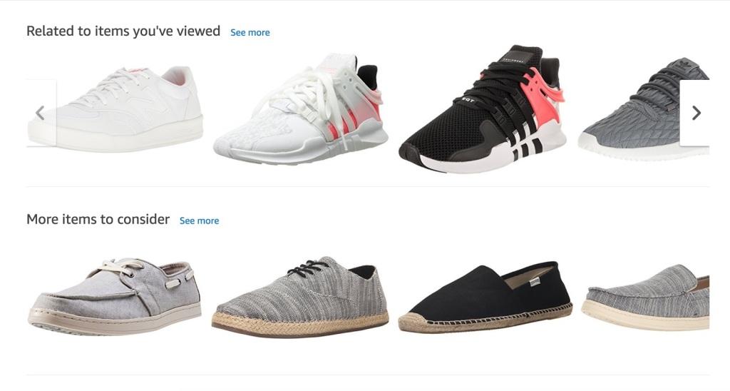
Example from www.amazon.com
5. Product page rules
Navigation through products creates real pain for customers if there is no strict organization in types of goods offered and impossibility to get rid of those products that are not interesting to a user at moment of time.
-
Filters
Too many options on a single page give a hard time to a user because they can’t easily make a choice when they are overwhelmed with different products, so they think it is better to give up and find another website. In case your store has to offer a ton of products, simplify the process of choosing and decision making by adding filters that make a list smaller.
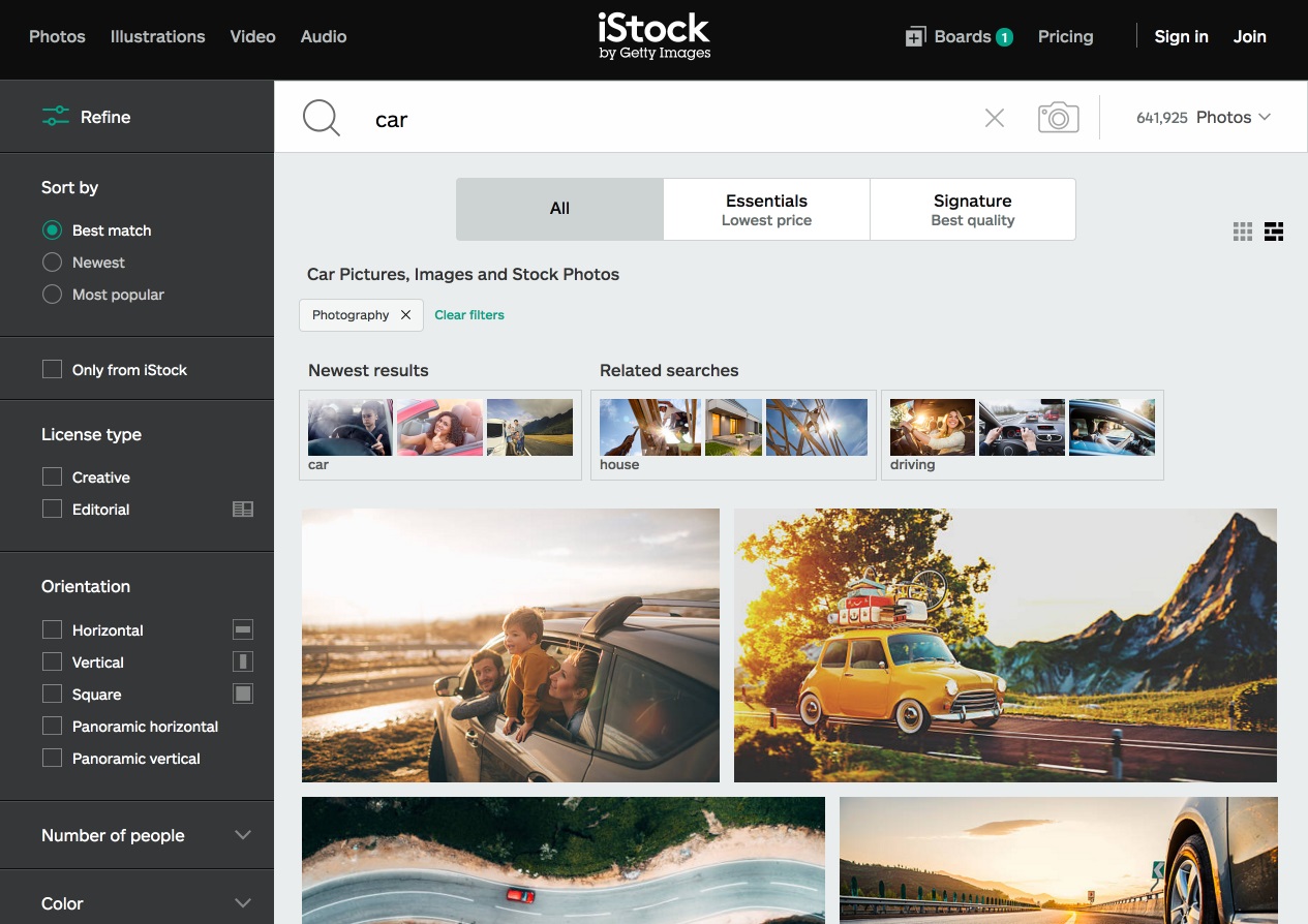
Example www.istockphoto.com
-
Simple layout
A similar idea applies to making a page layout less busy. A user should understand what information is crucial and what details are secondary.
Design elements can’t compete with each other and distract a user’s attention – instead of keeping the amount of visual information the same throughout the whole sales process, there should be less details on a screen at a stage where a user is going to make a purchase. The best thing for ecommerce design would be to remove any extra content, and make the page simple to avoid distracting a user from the final converting step.
- Following the patterns
The rule of consistency in online sales web design is also important. The first visit to a website is a new experience to a user. Looking around to understand what the website has to offer should not take much time.
Certain patterns are typical for most ecommerce sites, such as typical CTA button location, menu structure. Experimenting with user experience is costly and time-consuming and may result in getting a user confused.
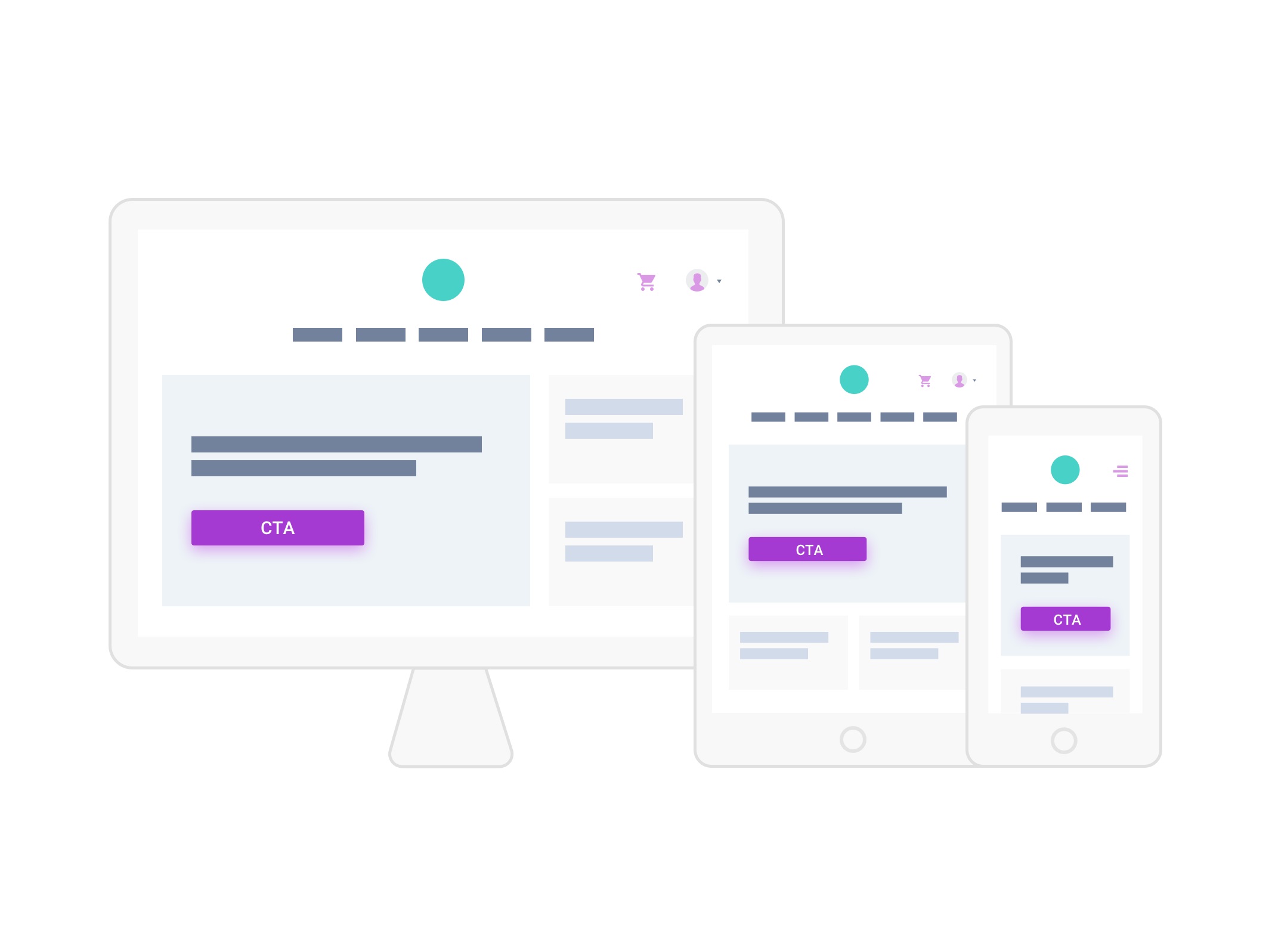
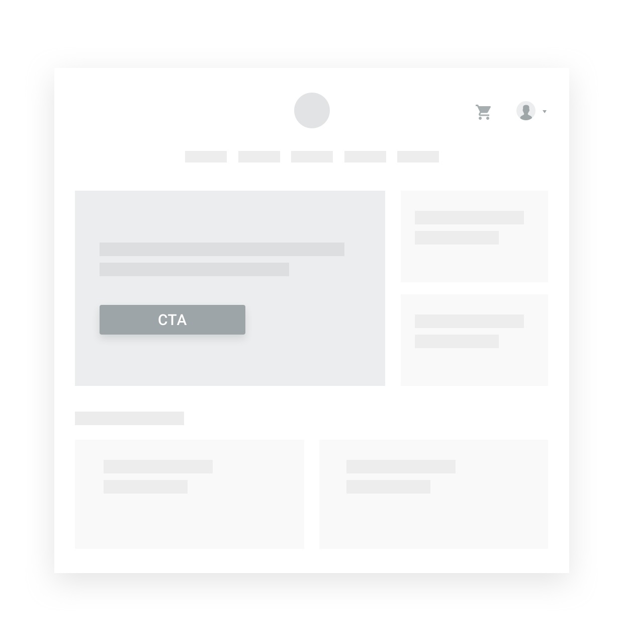
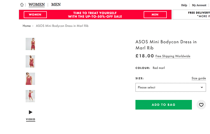
6. Call-to-action visibility
A prominent CTA (either a button or a registration form to collect leads) is essential for achieving the goals of an ecommerce website. It guides a user to taking an action desirable for your store, shows your customer how to react and what to expect. It is better to avoid making a user scroll down the page in order to see the CTA.
Example from www.adidas.com
7. Special product pages
Product pages that accentuate presenting one special kind of a product is a great way to get a potential customer familiarized with all special characteristics a product has, including detailed images, price, reviews, and descriptions. Such pages can be designed to demonstrate a user’s pain and how it can be solved with a particular product. Interactive sections provide additional proof about the product value and explain how easy and beneficial it is to use a product.
8. Using GIFs and video
-
Product video
High-quality product images make an impact, but product videos are even more successful in driving sales rates up. Users have already got used to watching product videos and the reason is trivial. Human brain processes visual information 60,000 times faster than printed text. Around 65% to 85% of users tend to make a purchase after they watch a product video. Product videos make a user’s visit duration longer and most probably such users will be back again. With product videos you can expect up to 85% sales growth.
Example from asos.com
-
Animated images
GIF files are a great choice for animated design pieces on the home page or product pages that make images less boring and involve an action. At the same time, it is better not to use GIFs for product images where you want to let a user see the details.
Example from www.shopbop.com
9. Design with emotion
According to Donald Norman, author of “Emotional Design”, customers tend to perceive things as effective if they look nice. Web design can evoke both positive and negative emotions. Design perception depends on whether the customer is a male or a female and their cultural background. If the website design does not affect a user emotionally, there is a great chance they would not want to engage with what it has to offer (especially women audience).
To attract users’ attention, it is crucial to find the golden middle in design and combine the features typical for an ecommerce website with your personal vision to stand out from other websites that offer similar products.
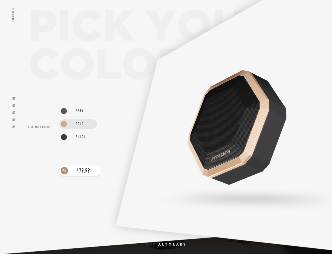
Example from http://pro.boombotix.com/
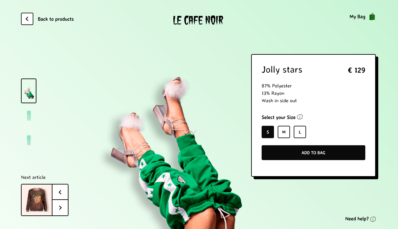
Example from https://lecafenoirstudio.com/
Content created by our partner, Onix-systems.