 Home
HomeDating Apps: Tips for UI and UX Design to Fall in Love with
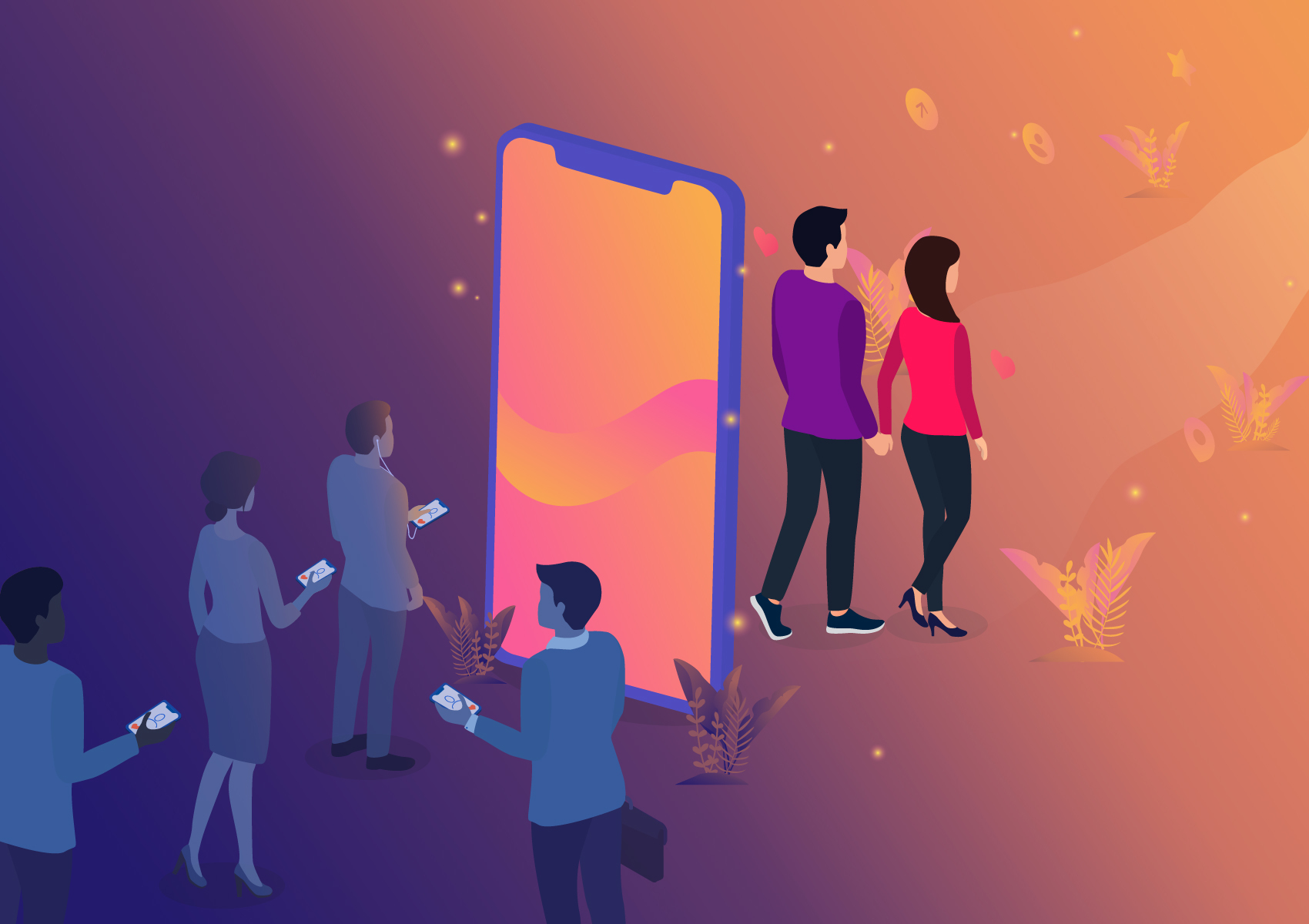
Love and companionship are fundamental human needs. However, it’s hard for busy modern people to spend quality time searching for the right person. As a result, a dating application has become a valuable service or at least a necessary evil for millions. It’s even predicted that by 2031, half of all married couples would have met online.
With a demand that high, a matchmaking website or mobile app looks like a promising business. The smart location-based Tinder has 50 million monthly users. Its success paved the way for new applications powered by big data and machine learning, attracting an ever-increasing user base and investors. The online dating segment exploded. There are apps specializing in serious relationships/marriage, hookups or escort, and catering to LGBT audiences, culture-specific, regional, health- or interests-based dating.
Despite all the abundance, entrepreneurs and startups still can find opportunities to earn money in the market. This post includes advice on how to design or redesign a dating app for success, paying special attention to the user experience (UX) aspect. We’ll be primarily discussing mobile apps because that’s how most users access dating apps. However, most guidelines apply to websites as well.
UX and UI Considerations for Dating App Developers
Tinder’s UX and UI seem to be its primary advantage over much of the competition. Uniqueness is a prerequisite for success, but best design principles and insights from leading dating app developers can be used as guidelines to your benefit.
Build Empathy for the End-Users
All people are different, so there can’t be a one-size-fits-all matching template or user experience design. UX/UI designers working on a dating application must possess a deep understanding of human psyche, mating patterns, and social norms. They must virtually embody the user to create a tailored solution for the very emotional experience.
Adopt this approach at the earliest design phase and maintain it throughout the product development. Start by figuring out what kind of people are going to meet, and why, and how. Your job is to take the headache out of the process. Tinder’s easy swipe left/swipe right mechanics resonates with people because it’s something they’d like to do in the real world. Because users never know someone had swiped left, there’s neither the fear of being rejected nor the guilt one feels when rejecting someone. Instead, Tinder makes users feel good when they receive a match.
64% of online daters are looking for someone they have something in common with, and 49% for someone with physical characteristics they’re attracted to. Improve their chances from the start! For example, Hater app connects people who ‘hate the same stuff.’ Badoo has a section where a user can look for their celebrity crush lookalike. During the election of 2016, Bumble introduced politically-themed filters. If needed, consider adding a separate functionality for LGBTQ users.
The feeling of safety and control over the dating experience are essential. Bumble was intended to make the process more female-friendly. It requires women to message their male matches first. Men have 24 hours to respond; if they don’t, the match expires. For women messaging other women, either party can respond first. However, this logic kind of leaves men waiting for a message, so think about your priorities and possible tradeoffs!
Hinge makes it easier for shy users to engage with matches. In addition to pictures and short videos, users may include into their profile a favorite meal, two truths and a lie, or similar info tidbits. Such a profile gives a better sense of their personalities. Others can ‘like’ a user’s specific photo or answer, comment or ask a question on that aspect, so it’s easier to start a conversation. The two-tabbed interface that allows toggling between the chat and the profile is helpful as well. One can go back to check on, e.g., the match’ dream vacation, if they need to address that in chat.
According to eHarmony, 53% of people lie on their online dating profile. No surprise that 44% of online daters have reported disappointment after meeting a match offline. To save its users the stress, Badoo added a live video chat option for matched users.
Meet General Users’ Expectations
The essential functionalities users expect to use in a dating application include:
Matching people
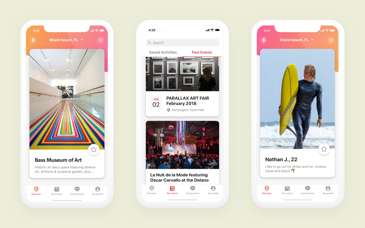
Dating app developers must know the end-users very well to design the best way to match them, e.g., with the help of algorithms or plain filters. Tinder matches users based on their preferences and location. Dine offers a unique matching style, integrating with Yelp. Users pick three suitable restaurants or bars. Based on the chosen places, they get matched with 2-5 people per day so they can request to go on a date in a restaurant.
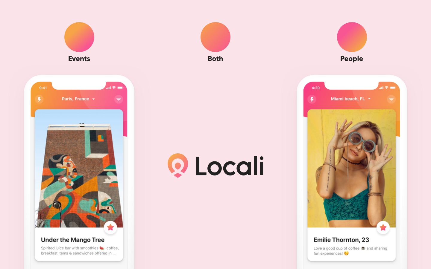
It also makes sense to allow search around places the users might be visiting or planning to shift to. Locali will have that feature. Not a conventional dating app, it’ll help people meet others while they travel.
Profile
Pay attention to the visual design. Even in Tinder, it’s not always intuitive or easy to find each person’s information, which then may turn out to be bare and/or irrelevant. People hate filling out long forms, though. Try to find a balance between Hinge’s detailed profile and Tinder’s minimalism. Start with defining the essential profile components, including the images and editable info like age, gender, interests, and other facts that users might like to share and others would like to know.
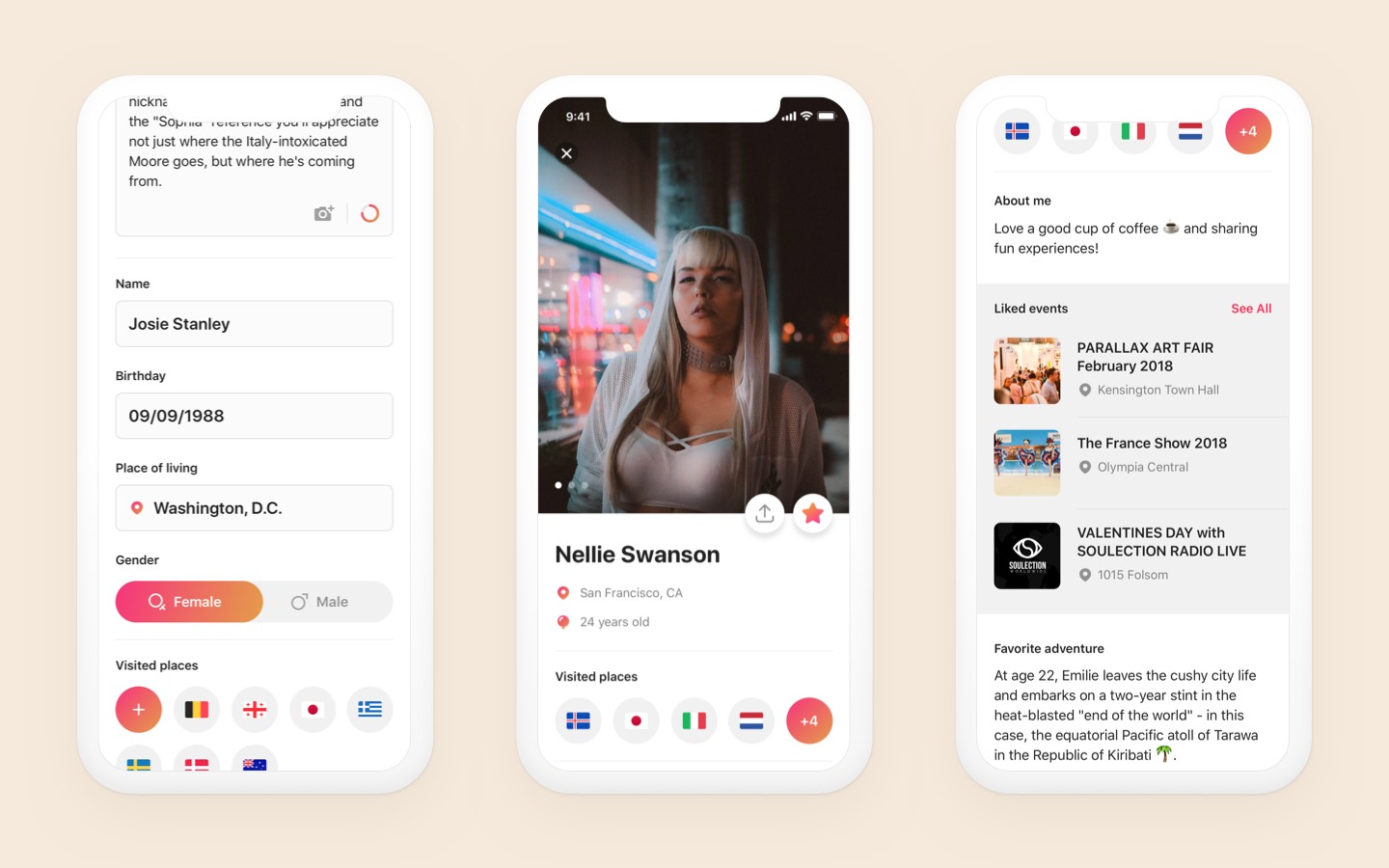
Several dating apps have made the profile creation more fun by adding cool graphics. Consider sign-up with Facebook which makes initial data entry automatic.
Access control
Users expect privacy and security from online dating services. Think of a safer user’s experience as your potential competitive advantage and consider investing in some form of security checks.
Zoosk, a dating app for serious relationships, validates your phone number first and verifies photos to confirm that they’re actually of you. It also uses an artificial intelligence algorithm to check user preferences and offers more confident matches.
It’s useful to integrate platforms like Facebook and Instagram to make log-ins and sign-ups to your dating application easy and fast. Sign-up with Facebook is not only convenient and helpful for filling out the profile information. It offers access to user data that you can use to suggest local singles and find common friends and interests. Hinge and Bumble pull a person’s full name, where they went to school, where they work, and any mutual friends from Facebook once they’re matched with someone. Her, a lesbian dating app, uses Facebook to check if a user who signs up is a real female person. It also checks the supplied email address against a third-party database to see if it has been used to create accounts on Twitter, LinkedIn or Foursquare.
If you offer sign-up with Facebook, make it clear that you’re not going to share any information associated with your app on the user’s Facebook timeline.
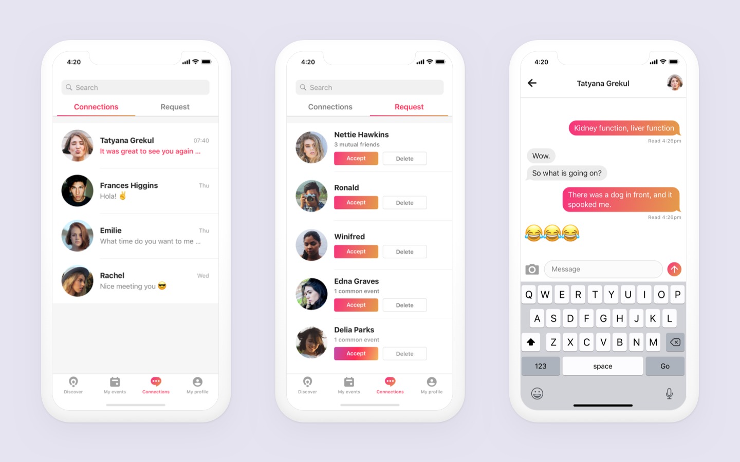
Messaging
Design the messaging logic and the user interface wisely. Push notifications need to be a part of the app to prevent users from missing out on a possible romance. Design smart real-time alerts about events within your application, i.e. messages, matches, reminders, and so on. The options include push notifications, pop-ups with advice, hello bars, personal letters, and personal assistant notes.
Interaction design
Nearly every interaction in a dating application is irreversible. If a user casually ‘likes’ someone, they’ll know. Accidentally rejecting someone, he/she might miss out on the love of their life. The interaction design thus requires special attention.
Make the navigation intuitive and pleasant. Minimize the work on the user’s part. Try to arrange the human-computer interaction in such a way that users can perform all the tasks with one finger. Most of the best mobile apps’ navigations are aligned to the bottom and are visible when users are browsing through profiles or performing main operations.
Bumble’s flow of pictures to personal information feels natural and comfortable. Unlike Tinder, it shows each person’s bio as the last screen to scroll through. The swipe down navigation is seamless. Still, some users might prefer readily accessible information on each individual.
Graphic icons and pictures can also be used for navigation implementation. If your UI designer can make users want to tap on an icon, half of the job is done. Just make sure not to overload the screen or page. Normally, there should be no more than three options.
Your guiding question throughout the UI and UX design process should be: ‘Is this feature easy, fun, and engaging?’ However great they seem to you, don’t overwhelm users with features. Identify what is truly valuable to them and optimize around that. Focus on simplicity and getting directly to the point, eliminating unnecessary pieces of UI. Make sure to test each feature or improvement with actual users before release to find out what distracts them, what is annoying, and what is useful.
Visual Design
Tinder’s user interface design makes the expectations and emotions of dating feel easier. The bright palette and playful animations help trigger more positive feelings. Even Tinder isn’t perfect, though. For example, there’s a bar at the top of each person’s profile indicating how many pictures there are. If a user has a light background picture, the white bar blends in too easily.
The palette helps set the right mood. If your app is promoting hot and passionate relationships, red may be a good choice. Bumble’s design template is very close to Tinder, but its bright yellow suggests playing on a safe side of happiness. BeLinked, which is connected to LinkedIn, feels more serious and helps build trust thanks to a purple-based design. If you offer some robust match-building algorithms to help people develop efficient relationships, you might try green colors.
The colors of Locali work in two ways. Three gradients, between sunny orange and lovely pink, channel the brand’s joie de vivre philosophy. Additionally, they vary depending on what’s on the screen: orange corresponds to events and pink to people the user might wish to meet.
Logo design deserves special attention too. People tend to remember icons better than words, so it’s always good to have a small image incorporating your brand’s ideas and values. Whether you go for a colorful and playful or a more serious visual design, keep it clean and consistent.
Make It Fun
The user’s experience with a dating app needn’t necessarily be ‘addictive’ (few need or can afford going out every night), but it definitely should be fun. The future of dating includes more real-time experiences, both virtually and in person. At Tinder, they see a significant potential in new media forms to represent users online.
You can gamify the app experience by rewarding users upon logging into the app, creating a profile with a number of pictures, or rating others’ profiles. Create a system of rewards that will correlate with the overall design and entice your target audience.
Matching in Augmented Reality is on similar lines with the game Pokémon Go, except in this you catch dates instead of Pokémons. FlirtAR is a pioneer in this market. The user can see a familiar neighborhood with balloon markers. Tap on a balloon opens up a profile. Now the user can initiate the first move on the app or in person if the other party is nearby.
VRCHAT builds a virtual space where one could talk to others from around the globe visualizing them as if they were in the same room. ‘You never know if the next avatar you will meet will turn out to be your next best friend.’ This makes romantic blind dates possible even if virtually.
Monetization Aspect
Although people spend tons of time on dating apps, they’re less eager to spend money on them. The monetization aspect thus requires special attention and creativity.
There are five basic dating app business models:
-
-
Subscription: Premium features are available within monthly, quarterly or annual pricing plans.
-
-
-
Freemium: Basic services are free and additional high-quality features for a fee. Valuable add-ons may be unlimited swipes and matches with the ability to go back on a rejected profile, or a ‘profile boost’ that makes a user show up in more searches.
-
-
-
Advertising: Revenue may come from in-app ads, native ads, in-chat ads, etc., or a paid version without ads and with more people to choose from. It’s best to display deals from businesses relevant to dating, such as restaurants, bars, florists, jewelers, or candy stores.
-
-
-
Gifts: You can offer digital stickers, emojis, etc., for a fee, or integrate gift-sending as a revenue model. Figure out how you can make mutually beneficial partnerships with local venues or gift shops.
-
-
Offline services: The app can book movie tickets, reserve a table, and so on. You might also host local dating events, such as speed dating, or sell event tickets in the app.
Try to play around with these options. Remember that users will pay only if you offer them something valuable.
Some Final Thoughts
The time of ‘Tinder clones’ is over; uniqueness is the key to success. Invest in original features, innovative new approaches to bringing people together, enjoyable UI, and best UX design to set your dating application apart from the crowd. Consider the strengths and weaknesses of your rivals. If you can make their user’s experience more efficient through enhancements or optimizations, you’ve succeeded.
If you found an exclusive niche in the market and wish to create a dating app ‘like Tinder but better,’ or upgrade your existing mobile app, attract a new audience, introduce paid plans an/or extra features, go ahead! Our web and mobile app developers are here to help. Whether it’s an estimate of your app concept, wireframes and prototyping, UI and UX design, software development, user research and testing — we can do it!
Content created by our partner, Onix-systems.