Correlation Vs Regression

On an intuitive level, we are using correlation and regression every day. An expensive car usually makes us believe the owner is financially successful whereas an old car indicates the opposite. Every mother knows the importance of a healthy diet: the better meals she cooks, the healthier her children should grow. Or not?
When researchers apply the same methods to large data sets, they can find associations between entities, measure the strength of such associations, and even make predictions. Both correlation and regression are known data mining techniques. In epidemiology, the analyses help estimate the association between an exposure and an outcome. Medical researchers may use the patient’s body weight to predict the optimal dose for a new drug, and so on.
The article includes a basic explanation of the correlation and regression methods. A comparison table will help you distinguish between the two more easily.
Correlation and Regression in a Nutshell

Correlation
Correlation analysis determines the relation between two quantities known as variables, ‘x’ and ‘y.’ Correlation is observed when, at the time of the study, a unit change in x is retaliated by an equivalent change in y. If an increase in x results in the corresponding increase in y (and vice versa), they are considered to be positively correlated. If an increase in x results in a decrease in y (and vice versa), it’s a case of negative correlation.
Knowing scores for one of the correlated variables allows predicting scores for the other. The capacity to predict is measured by a correlation coefficient. It indicates either the amount of relationship (or inverse relationship) or no relationship between the variables.
The following examples will illustrate a couple of methods that are commonly used for finding the correlation coefficient.
A scatter diagram is also known as a correlation chart or a scatter plot. Below is a simple example. The goal is to find any relation between the amount of revenue generated by a customer and their satisfaction with a company. Each dot represents a customer. The horizontal and vertical positions indicate the amount of money spent by each customer (x) and the level of customer satisfaction (y) respectively.
Figure 1. Scatter diagram of customer satisfaction vs revenue.
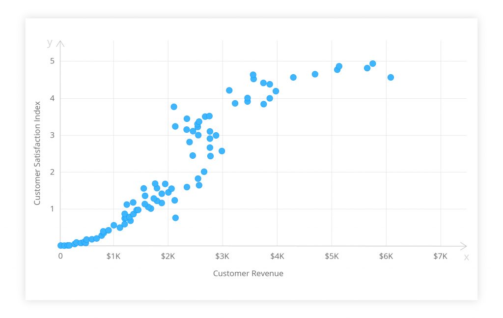
The extent to which the dots lie on a straight line indicates the strength of the relation. The figure above shows a ‘moderate correlation.’ The data points form a linear distribution pattern so you can assume that the customers’ satisfaction and revenues are somehow related. Were the dots spread randomly, one could surely say that no relation existed. If a straight line can be drawn by following the pattern, it implies a strong correlation.
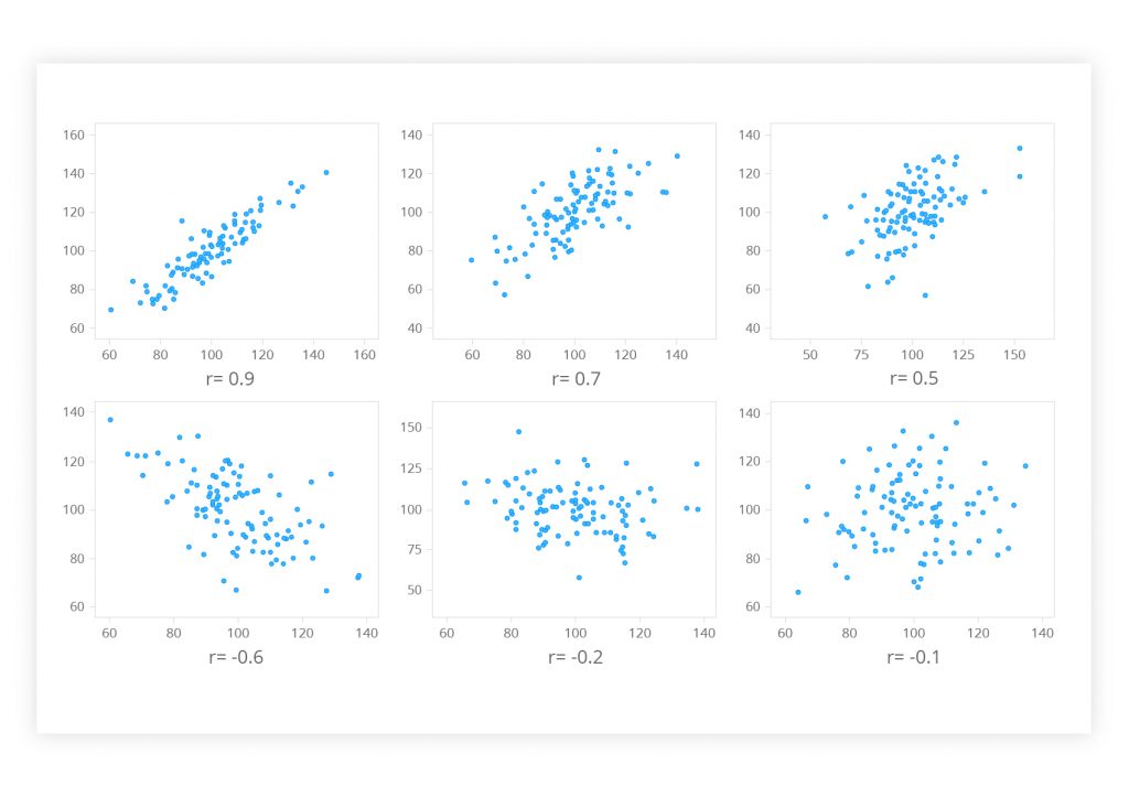
The Pearson product-moment correlation coefficient is another method. It may be the best way to measure the association between continuous variables. It states both the strength of the association and the direction of the relationship. The numerical value of the Pearson correlation coefficient (r) ranges from +1 to -1:
- r > 0 indicates a positive linear relationship between the two variables
- r < 0 indicates a negative linear relationship
- r = 0 indicates that no linear relationship exists
If the value is near ± 1, a perfect correlation is observed: when x increases, y tends to increase or decrease as well, or vice versa. If the r value lies between ± 0.50 and ± 1, the correlation is considered to be strong. Values lying between ± 0.30 and ± 0.49 mark a medium correlation. When r is below 0.29, there is a small correlation.
Figure 2. A Pearson correlation visualized as a scatter diagram
Сorrelation analysis makes no prior assumptions whether one variable is dependent on, or influenced by, the other. It actually tests for the interdependence of the variables. It is a regression analysis that deals with the effect of one or more variables on another variable, the outcome.
Regression
Regression analysis implies that the outcome depends on one or more other variables. The latter are referred to as x, predictor, prognostic, explanatory or independent variables. The horizontal axis of a graph is used for plotting the independent variable. The outcome (y) may be called the dependent variable, criterion or response. It is plotted on the vertical axis.
Regression analysis is about a mathematical measure of an average relationship between x and y in terms of original units of data. The average mathematical relationship is utilized to help estimate the expected value of the dependent variable based on a known value of the predictor. That makes regression analysis a reliable tool for forecasting events. For example, a company’s future sales can be estimated using past records.
There are many types of regressions based on the functionality. A simple linear regression helps to summarize and study relationships between two continuous variables, wherein y depends on x (or x influences y). The best linear regression model is obtained by selecting independent variables with at least a strong correlation to dependent variables, i.e. >= 0.80 or <= -0.80. The regression line of y on x is expressed as follows:
y = a +bx
where:
- y is a value for the dependent variable/outcome;
- a is the regression constant;
- b is the regression coefficient, the gradient or slope;
- x is a value for the independent variable.
The regression line, a.k.a. the least squares line, is a plot of the expected value of the outcome for all values of the independent variable. It is the ‘best-fit’ line through the data points on a scatter diagram. Its slope (b) is the rise divided by the run. (a) is the point where the regression line would intercept the y-axis.
If the regression coefficient is significantly different from zero, the dependent variable may be predicted for any value of the predictor using this straight line model. However, because the regression model is not a perfect predictor, the equation contains an error term:
y = a +bx + error
The standard error of the estimate is the standard deviation of the data points as they are distributed around the regression line. The standard error can be used to develop confidence intervals around a prediction. (More info on the linear regression problem is available in an earlier blog post.)
Figure 3. Regression line expressing the relationship between a firm’s advertising expenditures and sales.
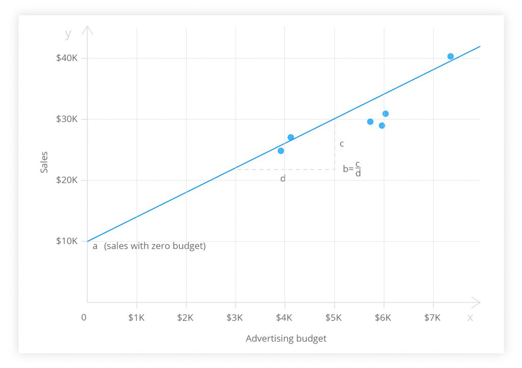
The figure above illustrates the regression analysis of a company’s advertising budget and sales for six months. The linear regression not only allowed the managers to reject the null hypothesis. They concluded that a significant positive relationship existed between the advertising expenditures and sales volume.
If the variables cannot be categorized as dependent and independent, the regression analysis may go wrong. Interchanging the variables in regression will give a different regression model (i.e. x in terms of y) against the original y in terms of x. In the calculation of the correlation coefficient, interchange of x and y will return the same value. That is yet another important difference between correlation and regression.
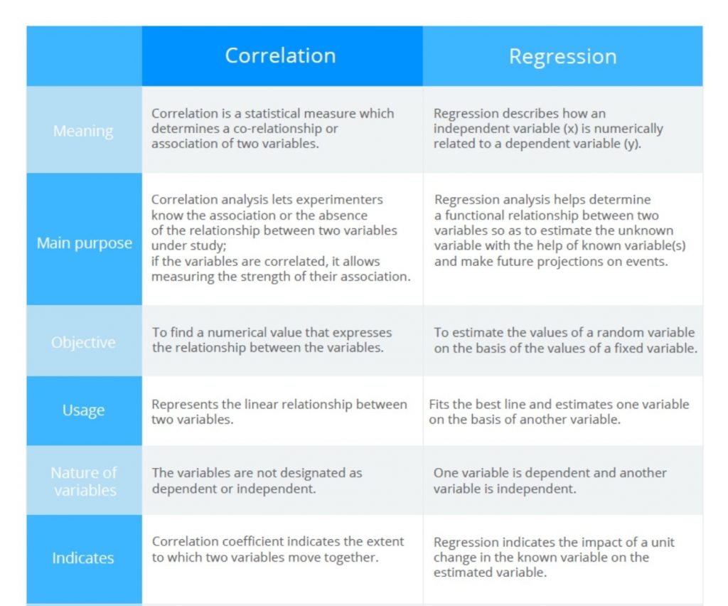
Figure 4. Comparison of correlation vs regression analyses
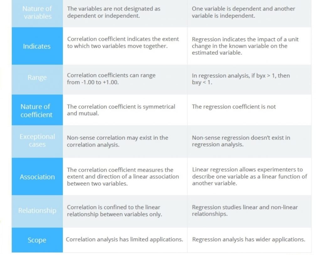
TL;DR
Correlation and regression are two analyses based on the distribution of multiple variables. They can be used to describe the nature and strength of the relationship between two continuous quantitative variables.
A correlation coefficient measures whether one random variable changes with another. In regression analysis, such an association is parametrized by a statistical model. That allows a more detailed quantitative description of the correlation. Correlation focuses primarily on an association between variables. It aims at finding a numerical value expressing the relationship. The goal of regression is to help explain and predict the values of the random variable based on the values of a fixed variable. Regression demands linearity, correlation less so as long as the two variables vary together to some measurable degree.
There are three primary uses for the methods:
1. Test for an association between two variables. The researcher determines neither variable; both are naturally variable. If an association is detected, the inference is that variation in x may cause a change in y, or vice versa, or that variation in a third factor may affect both x and y.
2. Testing hypotheses about cause-and-effect relationships. The experimenter determines the values of x and sees whether variation in x causes variation in y.
3. Linear regression helps in estimating the value of the dependent variable corresponding to a particular value of the independent variable.
Content created by our partner, Onix-systems.
 Home
Home