 Home
HomeFirst-hand Tips for High-Converting SaaS Website Design

The creation of any website requires understanding of the future users’ needs, well-thought-out content, web design, and testing, but the task is particularly tricky for software as a service (SaaS) companies. The goods they sell are rather abstract, and potential customers can neither see the goods in detail at a store, nor talk face-to-face with a salesperson.
Moreover, the competition in the market is tough and fierce, which means that SaaS companies set the bar extremely high for their home and landing pages. (A landing page is a specially designed single web page that appears in response to clicking on a search engine optimized search result or ad; its purpose is to collect the visitors’ information.)
Nowadays, web designers not only have to count and spare the visitor’s scrolls and clicks, but also compete for only 8 seconds of the average visitor’s attention to make an impression. A single page is expected at the same time to represent a business and its products perfectly and to convert mere visitors into customers smoothly. Although there is no rule of thumb for a successful SaaS website design, in this article we tried to list best performing UX trends and illustrated some with examples from our recent projects.
I. Purpose and Target Audience of SaaS Designs
The primary purpose of any landing page is to convert visitors into leads. However, visitors will share their information only in exchange for something valuable; the more valuable it is, the more information you can ask for. To create a compelling offer, answer the following questions:
- What stage of the buyer’s journey is this for?
- Which offer format will work best? E.g., free trial, online course, ebook, webinar, email course, etc.
- How will this benefit your target audience?
To attract customers and show how good their product is, nearly all SaaS companies offer a trial, and according to Totango, the best are able to convert 25% of their trial users into paying customers.
Despite the landing pages’ abilities, 44% of B2B companies still prefer directing visitors to their website’s home page. Either page may be a prospect’s first contact with a brand, so it is essential to develop a clear buyer persona before starting design. The layout and content must be created with the target audience’s preferences and expectations in mind: your customer should find the web page educational, engaging, and helpful enough to stay.
The Marketing Manager at elastic.io shared with us an idea of web design that should put their software as a service – an integration platform – center stage. The new page should simultaneously work as the SaaS website’s home page and landing for two types of prospects: IT professionals and less tech-savvy stakeholders. The new design was intended to instantly expose the visitor to unique services offered by elastic.io while highlighting the ease-of-use. Thus key elements and requirements of the landing page design were determined:
- introduction of the hybrid integration platform as a service via motion graphics that reflect the service’s high quality and the company’s cheerful approach to technology challenges;
- trial request as the offer;
- illustrations of service features appealing to both visitors who can code and those who cannot;
- ‘softer’ look-and-feel with lots of air to emphasize the company’s culture of openness, transparency, flexibility, and support for the customers.
II. Web Page Structure
It appears that landing pages of most SaaS companies include at least several must-have elements:
- headline / value proposition
- call to action (CTA)
- lead capture form
- ‘hero’ image to present the site’s most important content
- navigation bar
- social proof (customer logos or testimonials, awards, etc.)
- demo version
- scrollable content that gives the visitors additional information
- footer
The choice of the elements depends on each company’s business needs, but they still should be prioritized: the page layout and length (one screen or scrollable page) need careful consideration. The visitor will not scroll down a page without a good reason (with the 8-second average attention span to boot!). It is thus essential to put most valuable information above the bottom of the browser window as soon as the page loads. In case of landing pages, the most important elements would be the value proposition, call to action button or buttons, and lead capture form (if any). If you want to provide additional information, a scrollable landing is a good idea, but make sure that only one logical segment or call to action is displayed on one scroll.
Here are some useful SaaS design tips that may help you get the most out of your home page or landing:
- Headline
100% of SaaS companies use headlines to promote their product. While summing up your entire product, the headline should be short, compelling and easy to read to catch the visitor’s attention instantly. Before producing the headline, make sure you know your ideal buyer persona. Then, try to combine ‘what the business does’ and ‘what it does best’ into one sentence.
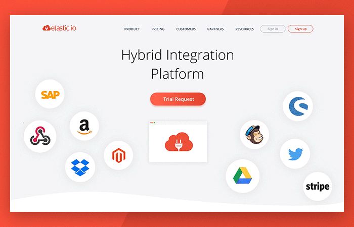
Elastic.io came up with a simple and elegant headline – ‘Hybrid Integration Platform’ – knowing that this rather understated value proposition would be complemented by an elaborate dynamic hero and a prominent CTA.
- The Hero
The hero element must impress the visitor the moment they land on your page. It may be a static image, carousel, animation, or a video designed to inspire emotion in your visitors, help them relate to your brand, and/or convey the emotional aspect of the headline. More companies are now putting a video in the hero section: a 30-second video can explain a product much quicker than the words and pictures can, as well as enhance the user experience. Since the users are expected to watch the video before they do anything else on the page, the designers create oversized play buttons, screenshots that are actually auto-playing demo videos, and other techniques to attract and keep the visitor’s attention.
Many premium video hosting services offer analytics so you will know how much content the visitor took in. Free services, such as YouTube or Vimeo, are available too. The video itself need not be expensive either: a computer microphone and screen capturing software may help you illustrate your product quite well.
Customer logos on landing pages seem to be a common social proof element with most B2B SaaS companies. Since elastic.io’s cloud-based platform connects various software applications, our designers decided to use this method in a slightly different manner: to integrate most recognizable application logos into an explanation of the integration platform as a service. Thus colorful logos were animated to ‘float’ around the headline and CTA. Their location implies there is more to see down the page, and when the user scrolls, they merge with elastic.io’s logo, which further transforms into a ‘cloud’ image and then into Speed, Extensibility, and Elasticity – three primary benefits for the customers.
- Call to Action
Historically, the sole purpose of B2B SaaS landing pages has been a click of the CTA, and only one. Nowadays, many businesses add a secondary CTA right next to the primary one, although with less visual emphasis (e.g., it may be paler or a ‘negative’ of the primary button). This technique is increasingly popular with companies selling to both small and enterprise-level businesses because it supports a sales flow linked to enterprise deals: the sales demo.
Although the top section of the web page should be as informative and bold as it could be, the CTA(s) should still be clearly distinguishable. The CTA’s text, size, color and location require special consideration. When choosing the color palette, make sure the layout elements are not too blended together: without the right color contrasts, prospects may get confused when they arrive on the page. Try to place the button where the mouse cursor naturally falls, next to an element that helps the user to evaluate the offer before they click.
The message in the CTA must be as short as possible, no longer than 5 words. The choice of words is also important: rather than reflect the desired action, try to emphasize the reward. For example, ‘Get your Free Ebook’ is better than simple ‘Download Ebook’. Create several CTA messages and test them to see which works best.
The home page/landing of elastic.io includes two CTAs; although both direct to the same form, their look and messages are different on purpose. The top CTA button was designed to stand out among the various application logos in the ‘hero’ section – and still it pops out from the animated background seamlessly. The second CTA is located close to the bottom of the web page, after multiple sections of the SaaS features descriptions and pictures. The button was intended to re-capture the visitor’s attention after all the scrolling and to remind about the goal – request for a demo. Another animation provided an elegant solution for it:
Lately, SaaS companies have been including one or more form fields alongside the call to action, so generally, the user enters at least their email before clicking. It is useful in two ways:
- If the next step after the home/landing page is a giant form, the drop-off rate is going to be high. Adding a little bit of friction up-front removes some from the second step.
- If the user abandons the process afterwards, the sales team still gets a well-qualified lead who at one point had the intention to sign up.
If you place a whole lead capture form front and center on the page, remember that it is the most critical part for generating new leads. The design must convince the visitor to enter their information in the form. Invest your time, creativity and energy into developing non-standard user-friendly forms.
Prospects, especially first-time visitors, are very protective when it comes to giving out their personal information in a lead capture form. Include a link to your privacy policy to put them at ease. It is also crucial to ask the right questions. Ask your sales team what information they need to guide leads through the funnel, and try to further reduce the number of questions. Neil Patel claims that he boosted the conversion rate on the eponymous website by 26% just by removing one field from the Contact form!
- Navigation bar
A navigation bar is essential for the home page. It may prove useful on landing pages as well, if you want to give the visitor the ability to find out more about the software, pricing, and company before clicking the CTA. (In that case, make sure to place the CTA on each page of interest.)
Knowing that a website menu may cause a distraction and lead visitors away from the Trial Request, the designer of elastic.io homepage included the following elements:
- a discreet non-sticky navigation bar with a limited number of links and mouseover effect
- sitemap at the bottom of the web page.
- Other Content
They say that in matters of engaging SaaS customers, ‘content is king’ and must be given first-class treatment during website design stage.
SaaS buyers are receptive to numbers: they like facts, statistics, metrics, and graphs. Include such information and eye-catching pictures that demonstrate that your software is useful, customizable, and easy to use. Since look-and-feel is crucial to most people’s buying decisions, images of your software will be an advantage. Some visitors would like to see the SaaS features, others to read about them – but most want both.
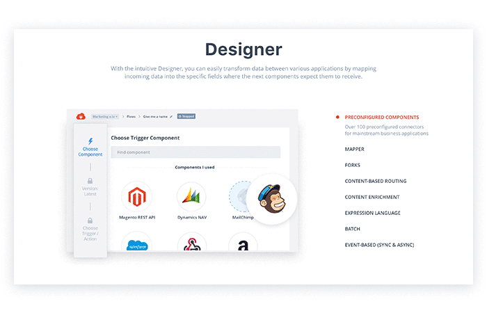
Make sure your visitors can skim and scan the page easily. Highlight key points with headings, bold/italicized text, bullet points, etc., utilize fonts that can be easily read on any device or browser, and add neutral background and white space. Take a look at elastic.io, where users can view a short description of each feature of the product alongside its screenshots:
Some visitors will want to immediately try out a product without having to sign up for a trial. First-time visitors should be able to access your demos within a few minutes of entering your site. Generally, demos are best served when they are just a click away.
If you want to convert more visitors into users, the creation of quality educational content is definitely worthwhile. An increasing number of businesses are using small sections of their landing page to highlight their news, articles, downloadable content, etc. Original content is evidence of a company’s competence and understanding of the audience’s problems and needs. It also offers a fallback lead-generation mechanism other than the product signup: even if a visitor leaves with a downloaded PDF whitepaper, it’s still a gain. Additionally, the element keeps the home/landing page feeling dynamic as fresh content is shown each time a user visits it. Create blog posts, videos, downloadable guides, case studies and internal pages which can tell the prospects more about your product and the benefits their business will get from it.
- Social Proof
Social proof may include, but is not limited to
- customer logos
- feedbacks from happy customers
- links to customer stories and/or videos
- links to case studies
- company’s awards
- social media buttons, etc.
These elements are usually placed either on secondary locations on a landing page or on separate pages. However, since SaaS business model is known to somehow lack the ‘human factor’, which may scare away some visitors, in some cases it may be reasonable to show them a fellow customer as a ‘hero’.
Some more tips:
- If you are putting customers’ stories and feedbacks front and center, select those customers that match your ideal buyer persona.
- If you want to show off your customer logos, make sure the cluster of logos looks neat and really complements the design of your landing page.
- Some company logos may work as links to rich customers’ stories or even videos.
- Contact Information
You may also increase conversions and sales by enabling visitors to find your contacts easily on the landing page, ideally without even looking for them. Typically, contact information is located either at the top or bottom of a web page. Wherever you decide to post yours, make it visible and clear. Also, invite the visitors to follow the SaaS company in social media, and add social sharing links and buttons.
III. Web Page Optimization
Landing pages are one of the core components of inbound marketing. For a home page, SEO still plays a huge role for page ranking. To realize a SaaS web page’s lead generation capability, apply the following best practices:
- Research long-tail keywords to use for your landing page
- Include your keywords in the landing title, headers, URL path, and content
- Include alt tags for your images
- Add social share buttons
When compared to other business models, the success of software as a service to a greater extent relies on the engaging potential of its website. Landing pages are particularly important for SaaS companies because of their amazing conversion potential. A landing page design for SaaS must complement its brand while giving exactly what the target audience is looking for.
A strong value proposition and call to action above the folder of the landing page remain the staples in SaaS designs. Include eye-catching images, animations and videos as illustrations of the product and/or as social proof, but emphasize the CTA. Try to showcase rich educational content, but stick to the right page length: keep it short and simple. Provide the ability to navigate and a useful footer, but do not distract the visitor from the offer.
A well-designed and SEO-friendly home and landing pages can help your SaaS business overcome the marketing challenge. We hope you will find the tips useful when developing or redesigning your website.
P.S. It is a common practice to build and test several landing pages at a time to increase the efficiency and conversion rates. What about a SaaS design with Alternative Spaces?
Content created by our partner, Onix-systems.