 Home
HomeHow to Make Sure Your Mobile Website is User-Friendly

Mobile search has become the norm, and most website owners have already optimized their desktop sites to be mobile friendly.
The following tips will help you check if your mobile website performs well on a tablet or a small screen of a smartphone.
Simple design and easy navigation
The key step in maintaining a high-performance mobile website is to remember that smaller phone screens can only display a certain portion of the content you have on your desktop website. The design and site structure works best with simplicity. Focus on including only the essential information that directly speaks to a user, making the experience design clear and easy to use.
If there is too much text or the site is overloaded with menu sections and sub-sections, you will lose much of your traffic. It is better to avoid putting all the information you have on your desktop website. Make sure the spacing is large enough for a user to perform an action and the page structure leads directly to the destination.
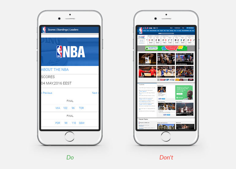
All long forms on a mobile phone should be shortened. It’s helpful to put an automatic Facebook connect button to make autofill the fields you choose. For multiple-page websites, it can help to add a search bar to enable users to find what they need in an instant.
1. Easy scrolling
Even though it’s possible to zoom with a pinch, this is not the easiest way for a user to view a website. Excellence in user experience is achieved through convenient filling in of text fields, enabling large checkboxes and buttons and adjusting content for the small screens on mobile phones.
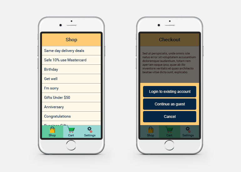
2. Easy actions
It is useful to provide users action options while they are viewing a mobile website. All icons and buttons should be intuitively recognizable, so visitors can quickly understand what will happen if they click on a button or an icon. For example, this includes social media buttons, call buttons, maps, email, form submission or playing a video.
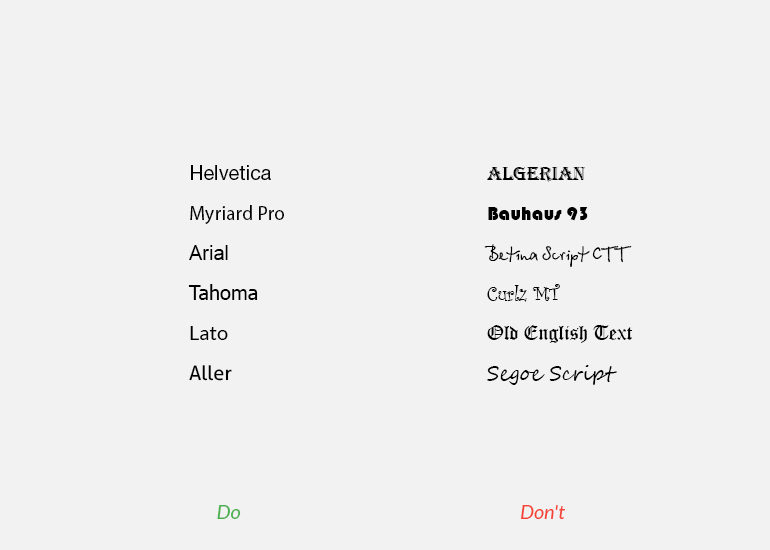
3. Readable fonts
Any text that you put on a mobile version of your website should facilitate capturing a user’s attention. Each letter should be legible and comfortably read. Among thousands of existing font styles, it is better to choose those that look simple and avoid presenting important content with sophisticated letter curves.
4. Concise text
The text you are going to put on your website has to generate interest with the targeted audience, so keeping sentences short and using descriptive wording that immediately appeal to users is crucial. Every word you speak on your web page should be in favor of your brand, services or products you offer.
Structurally, a good mobile web page includes clear titles and slogans, a mission statement, short text presented with bullet points, call-to-action buttons and scroll menus. Emotional impact in mobile design is achieved through clear structuring, color choice, and informative imagery.
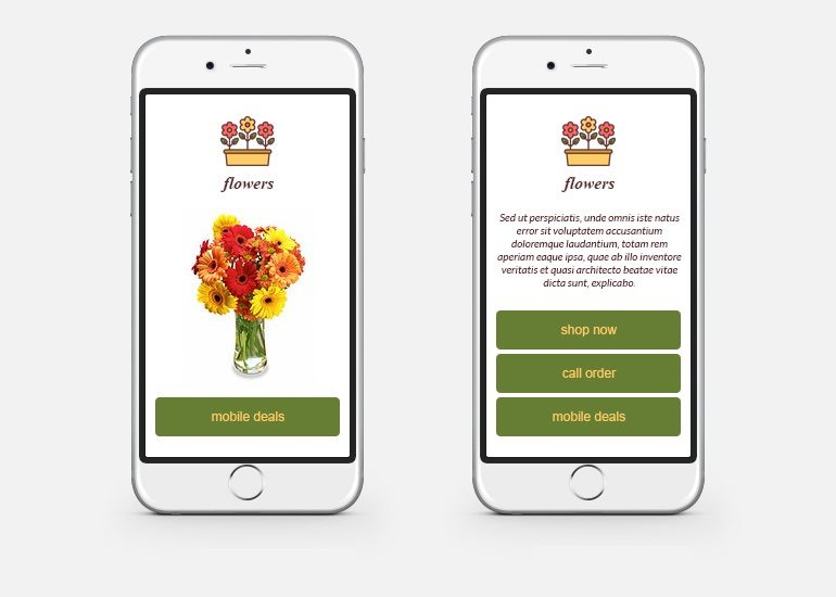
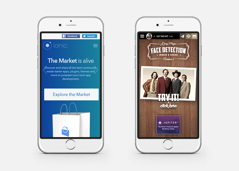
5. Catchy imagery
On a mobile website, the use of hero images and multiple photos will not make a lasting impression and you can’t rely on too much text since it will not be read – each image used on your website should convey a message, emphasize the main concept and build a rapport with a user. Color choice for imagery becomes essential.
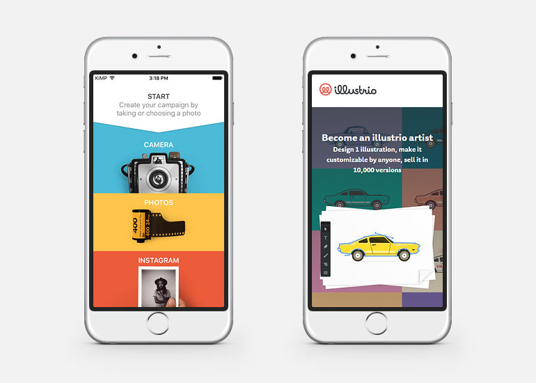
Images on a mobile website have to be compressed and resized to increase the loading speed of a web page, so taking that into account is important.
6. Excellent scalability
The number of devices with different sizes and resolutions is growing. Pages must be tailored to horizontal and vertical viewing and rely on the newest technologies (e.g., the newest version of HTML). A website optimized for mobile search not only ranks higher with Google, but also ensures the smooth running of AdWords campaigns.
Be sure to set up analytics to keep track of your mobile traffic because many mobile devices do not allow cookies automatically. Additionally, you may also try updating your website and checking how it performs with A/B and multivariate testing.
Read more:
5 thoughts about using images on a website
Content created by our partner, Onix-systems.