 Home
HomeWeb Design for E-commerce: Mistakes to Avoid

The primary purpose of every e-commerce website is to sell. This includes attracting large numbers of visitors, convincing them to buy, and retaining first time buyers as future customers. Сompanies spend huge amounts of time, effort, and money on digital marketing and other activities to drive traffic to their online stores. Competition is fierce as they are struggling for each and every customer. Given these high stakes, losing customers due to web design defects is expensive and painful.
We don’t mean to say that a faulty homepage will sink your ship. Usually, it’s more complex e-commerce mistakes that are the culprit. Still, isn’t it wise to check the rigging? Can your product page be better at converting leads which you worked so hard to bring there? Is there something disrupting the sales process? Does the website provide a top-notch shopping experience?
A blog post does not generally provide enough space to thoroughly examine a complete list of all possible mistakes. However, we have condensed the most common problems into five groups. If you plan to run an online store, be aware of these. If your current site is causing you some concern, you might pick up a few improvement ideas to help you out.
1. Wrong Imagery, Layout, and Visual Style
A visitor forms a first impression of a business within seconds of being on its website. A cluttered, flashy, and loud webpage is not inviting. Subpar photos, a lackluster value proposition, and an outdated brand can add to an already negative impression.
Luckily, the most apparent shortcomings are also among the easiest to correct. If you can’t completely overhaul the website, you should pay attention to those things first. Small and incremental enhancements may increase conversion rates without most visitors even noticing the changes. Every pixel, every picture, every shade, and every word matters. De-cluttering improves the look and usability of a webpage but excessive white space can make it feel too long.
Neglecting your customers is one of the worst mistakes you can make. Without an analysis of the users’ behavior and research into the needs and preferences of your target groups, you won’t be able to make the visual design, calls-to-action, and other essentials most appealing to them.
One thing is for sure: stock images don’t appeal to anyone. They occupy the precious space of an online store but don’t showcase your products or say anything about your unique business. Looking careless, they can ruin an otherwise good design and damage the perception of your business.
Talking about corporate identity, a superb logo is more than a homepage element. Like the whole website, it must elicit a successful, professional feel. Your logo and company name should reflect not only what you’re selling currently but also your future opportunities. If you feel your company symbol holds you back, it’s high time for a new one.
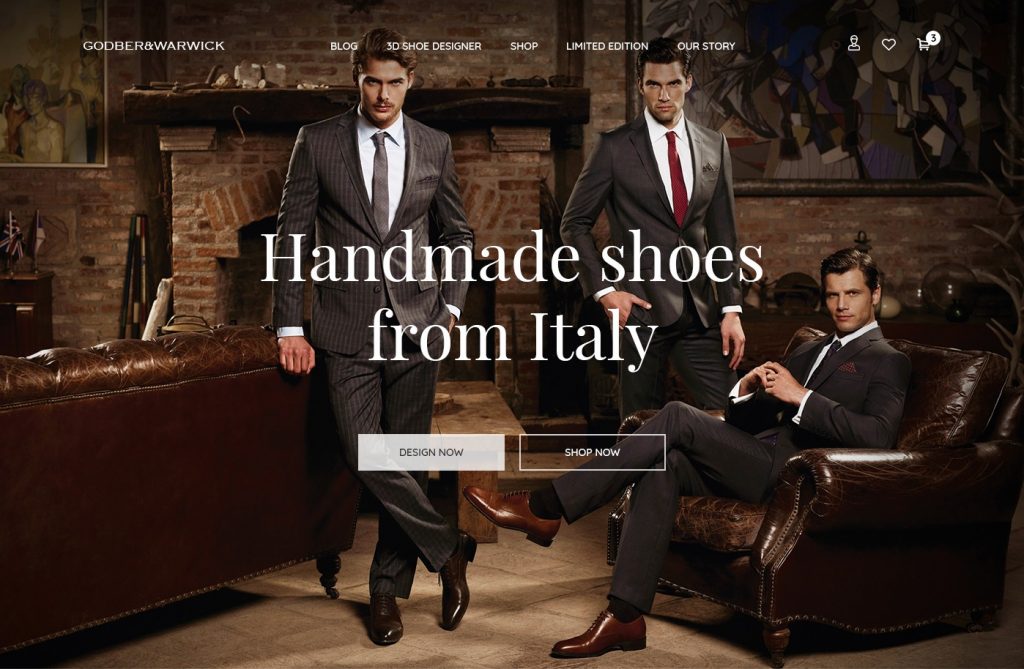
Don’t waste the ‘above-the-fold’ space of your homepage. It takes just milliseconds for an average online surfer to decide whether to stay or leave. You won’t keep such quick visitors without a killer value proposition. The headline needs to be clear and concise. Support it with a classy authentic hero image (like Alternative-spaces designers did in the design below).
A short, mute yet impressive autoplaying video is even more effective but still not the end of all worries. If you fail to highlight discounts, new branded goods or special deals immediately, you risk losing the interest of both new and recurring online shoppers. It’s recommended to place eye-catching offers or news of a sales time period on the upper part of a homepage. And don’t forget to emphasize free shipping or other similar enticements if you have them.
A product page must have all the essential selling elements above the fold. One of the worst things that can happen is for the product image(s) to conflict with the description.
Poor images on e-commerce stores not only increase the bounce rate, they can also hurt physical store sales since many users still prefer to research online and buy offline. If the product photographs and overall website design fail to impress, the users won’t visit the physical store either.
2. Faulty Navigation and Shopping Process
If a visually appealing online shop fails to sell, it could be the fault of a poor user experience (UX) design. Don’t assume visitors have tons of time to spend on your site. People shouldn’t be expected to guess about what to do next. Reduce the number of scrolls and clicks required to make a purchase. Nothing should distract a user from shopping and buying.
It’s a mistake to make visitors search for exclusive deals and hot prices. Neither should a search for items take a long time. Invest time and money into an excellent search experience for your users. If your online store offers a wide range of products, a prominent search box is necessary. The search must provide an optimal number of clear and easy-to-read results (consider using product image thumbnails for that). Test the placement, size, fonts, and colors of your search box: all of them can impact the user experience. Also, don’t forget to design a distinctive badge to add to product images when an item is out of stock.
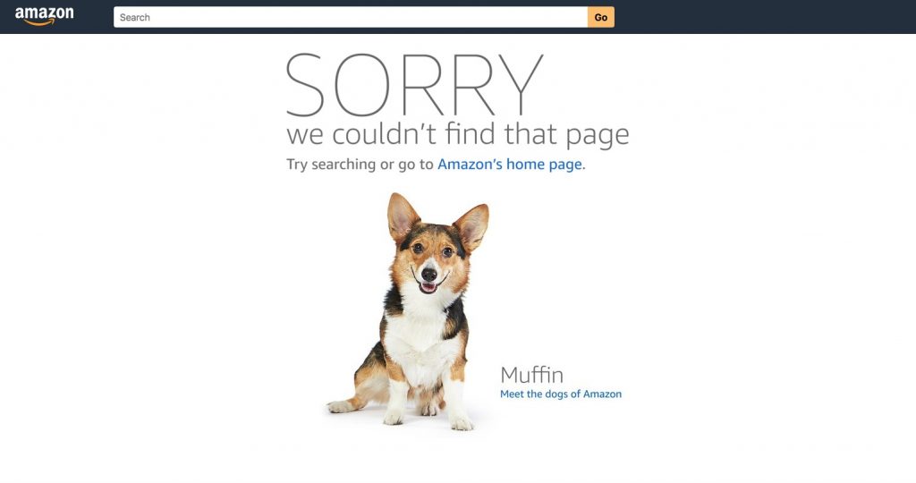
Blank pages with ‘No Results’ or ‘Page Not Found’ will stall the visitors’ shopping and may turn them away for good. Instead, suggest alternatives to the visitor’s search and design smart ways to direct them where you need to. Amazon’s solution is adorable, but you should know the target audience to find your own solutions.
If the user faces an overwhelming number of options, they still may leave as well. Usually, it’s not advisable to provide a choice of more than fifteen links to click on a page. Equally frustrating is the need to view different products’ pages to weigh each one’s pros and cons. Instead, let the visitors check the products they like and provide a cleverly designed page where they can compare the checked items.
A complicated shopping process and nasty surprises during checkout cost retailers billions of dollars annually. The purchase process should be displayed clearly in an easy to understand format as early as possible in the buying process. All shipping, return and exchange policies, customer support pages, etc., ought to be linked on your homepage.
Few things upset online shoppers more than seeing unexpectedly high shipping costs or the inability to use a certain payment method just before they are about to make a purchase. Display acceptable credit cards or other payment options, shipping costs, delivery charges, and other info in plain sight on the home and product pages.
Even after the customer clicks ‘Add to Cart,’ blunders are still possible. Many e-commerce stores continue making a grave mistake by constantly pressing new visitors for registration. Those who want to buy just one product may be reluctant to sign up, or have no time and wish to make a purchase first and sign up later. Allow them to save items in the shopping cart as a guest and then come back to complete the purchase.
Another mistake is to stun someone close to registering with an enormous form. Make sure the signup process is simple, painless, and takes no longer than 20 seconds to complete.
Don’t forget about those who visit an online store to find the nearest physical store address. Place a store finder tab on the top or bottom right corner of the webpage. For an extensive network of shops, provide the ability to search by country, city, zip code or address.
3. Trifles that Undermine Trust
An outdated, poorly designed site and confusing shopping process hardly increase the users’ trust. But don’t neglect the elements that specifically promote trust. Otherwise, people might wish neither to purchase from you nor to share their private information.
Testimonials and trustmarks belong to such ‘trifles.’ (The latter are thumbnails or logos marking a security guarantee by an external party.) Product reviews also can encourage potential buyers to purchase. However, the same elements on a big brand online store would be overkill.
New online shops, especially those presenting a new brand, should not omit ‘About Us,’ FAQ, and ‘Contact Us’ pages. 24/7 hotline, live chat, or a chatbot system can improve both customer service and your credibility. Add relevant information in the header and the footer of the website.
The absence of social media links can be a mistake. Social network accounts facilitate both customer support and online shops’ promotion while social media sharing links on a product page help spread the word about a product.
4. Annoying your Users
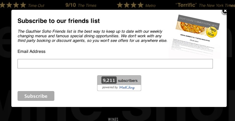
It’s a bad idea to greet visitors with popups: they are outdated and spoil the user experience. Users hate filling out surveys, signing up for newsletters or sharing personal information without a clear reward. Bombarding them with popups makes things worse. Consider instead placing the promotion as banners on the sidebar of your pages. Users who want additional information will click the banner.
Advertisements that take over a webpage and make the user navigate around them are hazardous too. Your online store is not going to generate revenue primarily through paid advertising, is it? If so, give up all ads that interrupt the visitor’s time on your site. In fact, a good web designer avoids using any graphics that get in the way of users.
5. Not Mobile-Friendly Online Store
Do you know that average smartphone conversion rates of e-commerce websites are higher than those of desktops’? If you are not optimizing for mobile users, you are losing at least 50% of the conversion of your website.
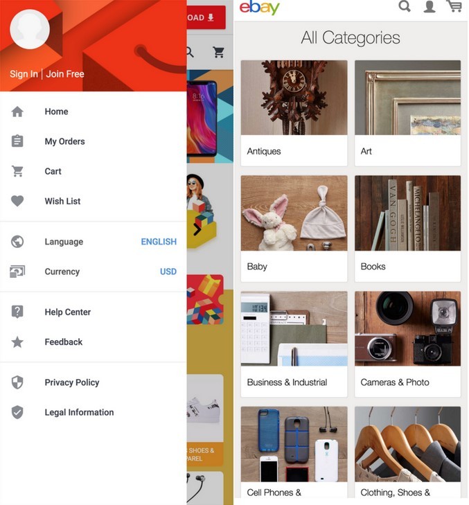
If possible, follow Ebay’s example and opt for a minimalist interface with easy navigation which is more suitable for smartphone and tablet screens. Streamline mobile checkouts, e.g., by encouraging customers to create sign-ins and save the data. However, you should also allow for guest checkout if they don’t want to store private information.
If your online store is already well-optimized and user-friendly but not enough to increase sales, a brand new mobile shopping application might do the trick. It will help you reach a new audience or improve the user experience for the most mobile-centric groups.
What Makes a Good E-commerce Site Then?
Online stores are sophisticated systems which require constant iteration, keeping up to date with the best products and latest trends, and a robust data-driven multichannel marketing strategy. Everything should be aligned with that strategy, including the visual design of the e-commerce website, marketing techniques such as search engine optimization, email marketing campaigns, social media boosting customer advocacy, etc.
Invest in an authentic, clean, and professional-looking website and the best personalizedcustomer experience. An optimized UX reportedly can increase a site’s conversion rate up to drastic 400%! More information on what makes a good e-commerce site design is available here.
If your current site falls short for some reason, it’s high time you sort it out. But be careful: a haphazard redesign may be counter-productive. Your web designer or team should understand what you’re really after and identify the points of friction that reduce your e-commerce store’s effectiveness. Alternative-spaces embraces a holistic approach to UI/UX design and development to cater to the needs and preferences of online shoppers and help our customers succeed in this unprecedented era of online sales.
Content created by our partner, Onix-systems.