 Home
HomeMatters of the HEART: How to Measure UI and UX Design

Lately, we have published recommendations for dating app developers. As we were addressing best design principles or mistakes, we felt that perhaps something was missing. How should a team track the quality of their product’s design? What indicates that an app’s user experience (UX) is efficient? In case an existing interaction design needs improvement, how can it be evaluated to see whether the change has worked? In this post, we’d like to pay some attention to metrics that are used for measuring UX and UI design efficiency.
Measuring UI and UX Design
Numerous key performance indicators (KPIs) are used during product development across various industries. However, there is no general hierarchy or even a universally adopted classification of the UX and UI metrics.
For example, there is a simple division of usability and UX KPIs into two categories: behavioral (what users do) and attitudinal (what users say). This approach resonates with the need to understand customers’ needs and how they are using software products.
Behavioral UX KPIs are gathered via task-based usability testing. (Usability itself is the lowest standard in user experience design. The UX/UI designer and app developers must ensure at least that the users can do what they want to do with the product. The four dimensions of usability testing are functionality, flexibility, learning ability, and aesthetic user interface design.) Just a few examples:
-
Task Success. It’s crucial to define a realistic task success clearly, e.g., to complete a profile in an online dating application. TS is typically calculated as a percentage. If 8 out of 10 participants completed the profile and 2 failed, TS should be 80%, but it isn’t. Given the small sample size, we only can be 90% confident that the TS percentage lies somewhere between 55% to 100%. To minimize the ‘Margin of Error,’ secure a larger group of representative users.
-
Task Time. This is normally an absolute number, e.g., when the team collects the times it took the participants to make an order online, and then calculates the Average Task Time either for the whole group or only for those who accomplished the task. Generally, faster task completion is the goal, but sometimes the opposite is desirable.
-
Problems and Frustrations. The best way is to ask the participants to think out loud while they are using your mobile app or site. This KPI may be the number of problems identified during the usability testing and/or the number/percentage of users that encountered a certain issue.
The collected behavioral KPIs are eventually compared either with the same product’s KPIs over some time (e.g., quarterly) or with a rival software.
Attitudinal UX KPIs show how users feel before, during or after using a product, and how this affects their perception of the brand. Most of the questions are asked towards the end of a task-based usability study. Among the attitudinal UX KPIs, three seem to be most important:
1. Net Promoter Score (NPS) helps you measure loyalty based on direct questions like ‘How likely are you to recommend this dating application to your friends? (on an 11-point scale). Those who responded with a score of 9 or 10 are called ‘promoters,’ those with a score of 7 or 8 are called ‘passive,’ and those who responded with a score of 0 – 6 are the ‘detractors.’ Calculate the percentages of those users. NPS = Promoters – Detractors.
2. System Usability Scale (SUS). SUS in user research helps measure the ease of use. Even conducted on a small sample size, it can indicate whether the user’s experience has improved or not. For every usability test carried out, users complete a questionnaire of ten items. They may click on an option from ‘strongly agree’ to ‘strongly disagree,’ e.g.,
-
-
I think that I would like to use this app frequently
-
-
I think the app is easy to use
Each respondent’s scores for the questions are added together and multiplied by 2.5 to convert the original scores of 0-40 to a SUS score between 0 and 100 points. A score of 68 is considered the average SUS score; everything else is either ‘above average’ or ‘below average.’
3. Customer Satisfaction (CSAT). It’s calculated by asking questions about the user’s experience, e.g., ‘How satisfied were you with searching for a date?’ A corresponding survey scale is used, which can be 1 – 3, 1 – 5, or 1 – 10.
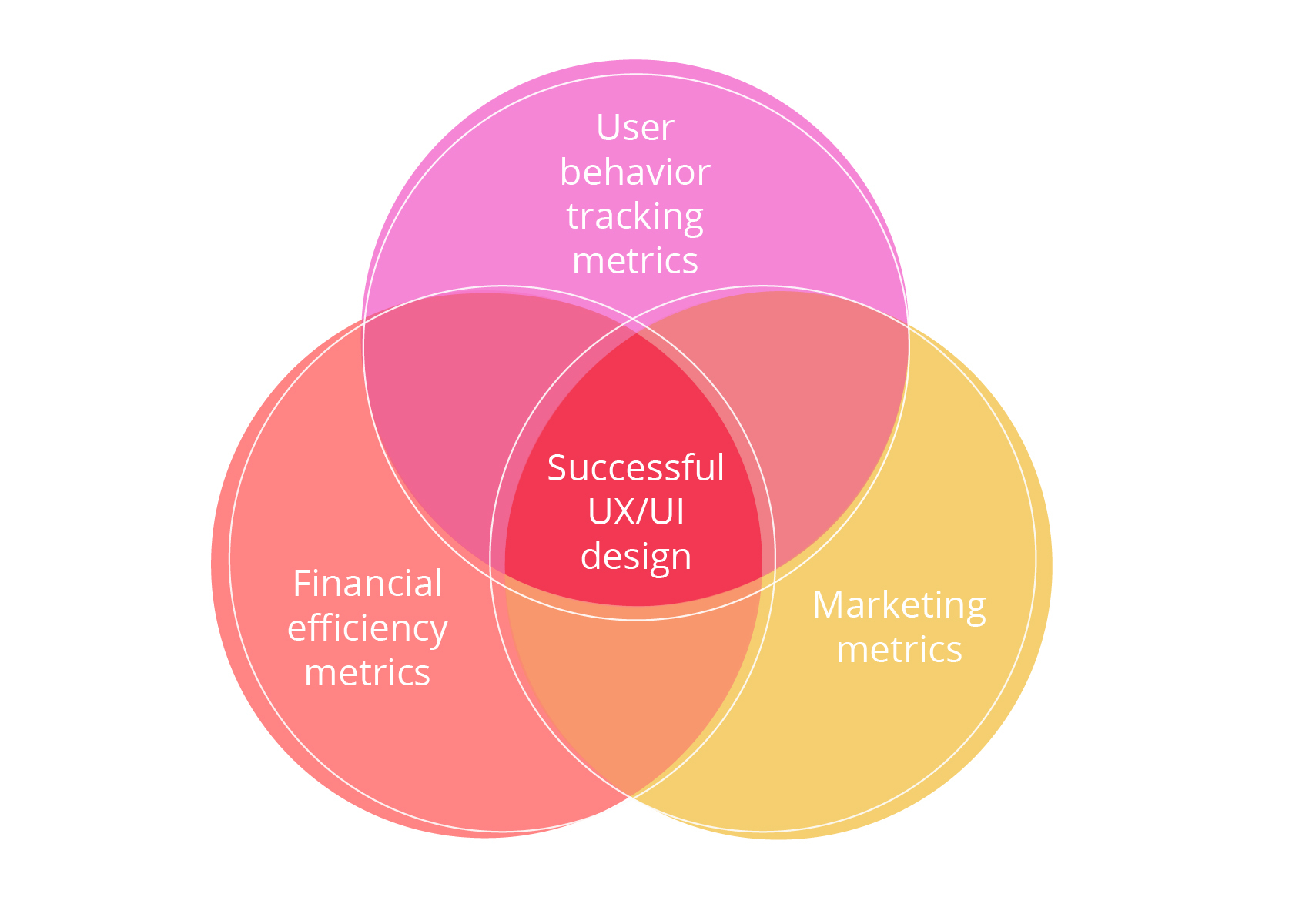
Ideally, for measuring UX efficiency, the behavior-related metrics should be matched with financial and sales and marketing-related measurements. The latter category includes, but is not limited to, social media impressions, brand trackers, search metrics, and so on.
Financial efficiency metrics allow to evaluate ROI in UI and UX design:
-
Conversion rate typically means the number of sales/number of visits. Conduct user tests to understand why specific components of your UX and UI convince users to accept your offer or drive them away. Brand elements, usability, and accessibility are all relevant to this. For example, if the number of people who are converting increased/decreased after a visual design change, and you can measure that accurately, you can be confident the change made an impact.
-
Single usability metric (SUM) to record errors. Standardized SUM measures task completion rates, task time, user satisfaction, and error counts. The analysis of design errors helps to understand how you can avoid them, create the best UX design, and drive users into your conversion funnel.
-
Bounce rate, regarding financial indicators, allows building a proper conversion funnel on the product. For instance, navigation bounces metrics tracks bounces over screens, creating a route of a user before they went back to the start of the app experience.
UX metrics can also be classified into low and high levels. Common low-level metrics are traceable indicators like:
-
-
Page views or the number of screens viewed by a user;
-
-
-
Engaged page views per visit;
-
-
Latency (the time it takes the app to respond to a user’s action), and so on.
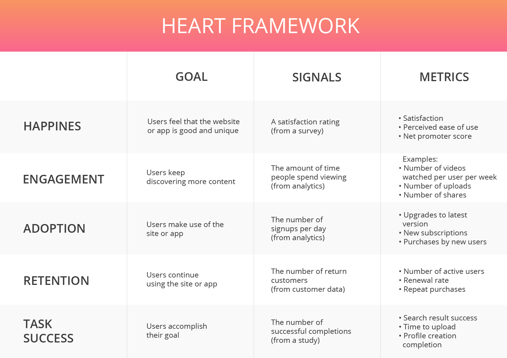
Google’s HEART framework is popular for measuring high-level metrics. It combines the essential KPIs listed above and adds others to deepen the understanding of how a product’s UI and UX design works:
H – Happiness. This measures the extent to which users enjoyed using your product. The info is often collected via surveys at the end of UX tests. NPS is an example.
E – Engagement. The extent to which users are involved in a mobile app or website is directly related to its quality. The number of visits per user per week and the number of taps, screen refreshes, steps taken, or other actions can be measured rather easily.
A – Adoption. This means gaining new users of a product or feature. Adoption can be traced, e.g., by the number of upgrades to the latest version, new subscriptions, or purchases made by new users.
R – Retention. This includes the number of people that are consistently using the app or visiting the website within a specified time frame, repeat purchases, renewal or churn rates, and so on.
T – Task Success. In this case, Task Success covers a broader range of metrics tracking a user’s actions, such as how well the task was accomplished, how long it took, how many errors occurred, and so on.
Google Analytics (GA) (mobile and web analytics) is arguably the best tool to overview your UX design efficiency, and it’s free. Heap is a decent substitute to GA and great in terms of setup. The service allows you to examine the most crucial data and build your own system of metrics. Localytics for mobile analytics is a great freemium multi-platform tool with advanced segmentation and easy-to-use features.
However, data shows only a part of the story. GA can tell you what is happening, but you can’t understand why things are happening until you see real people using the software. The best way to evaluate design is to receive feedback from the target audience.
Conclusion
UI and UX design process require constant iterations and improvement. Make a plan for improving the user experience and keep its efficiency measurement running to maintain control over your product development. Various metrics enable you to measure the convenience and comfort of the end-users during a human-computer interaction, the popularity of your product, and certainly the skills of your UX/UI designer and app developers.
The team should study the users’ contact with the product to determine whether the UI and UX design meet their needs. Get users involved and obtain feedback instantly from the early product design phases through the continuous product improvement after release.
Avoid the temptation to stick only to low-level or to marketing or financial metrics. You cannot make decisions based solely on conversion rate and similar numbers; stats are useless unless you consider the users’ opinions. A well-crafted survey and interviews are best at pointing out flaws. Use direct interaction with users, user journey research, and feedback that people in contact with end-users receive (e.g., customer support team). Only a combination of the various data will give you the correct vision.
Content created by our partner, Onix-systems.